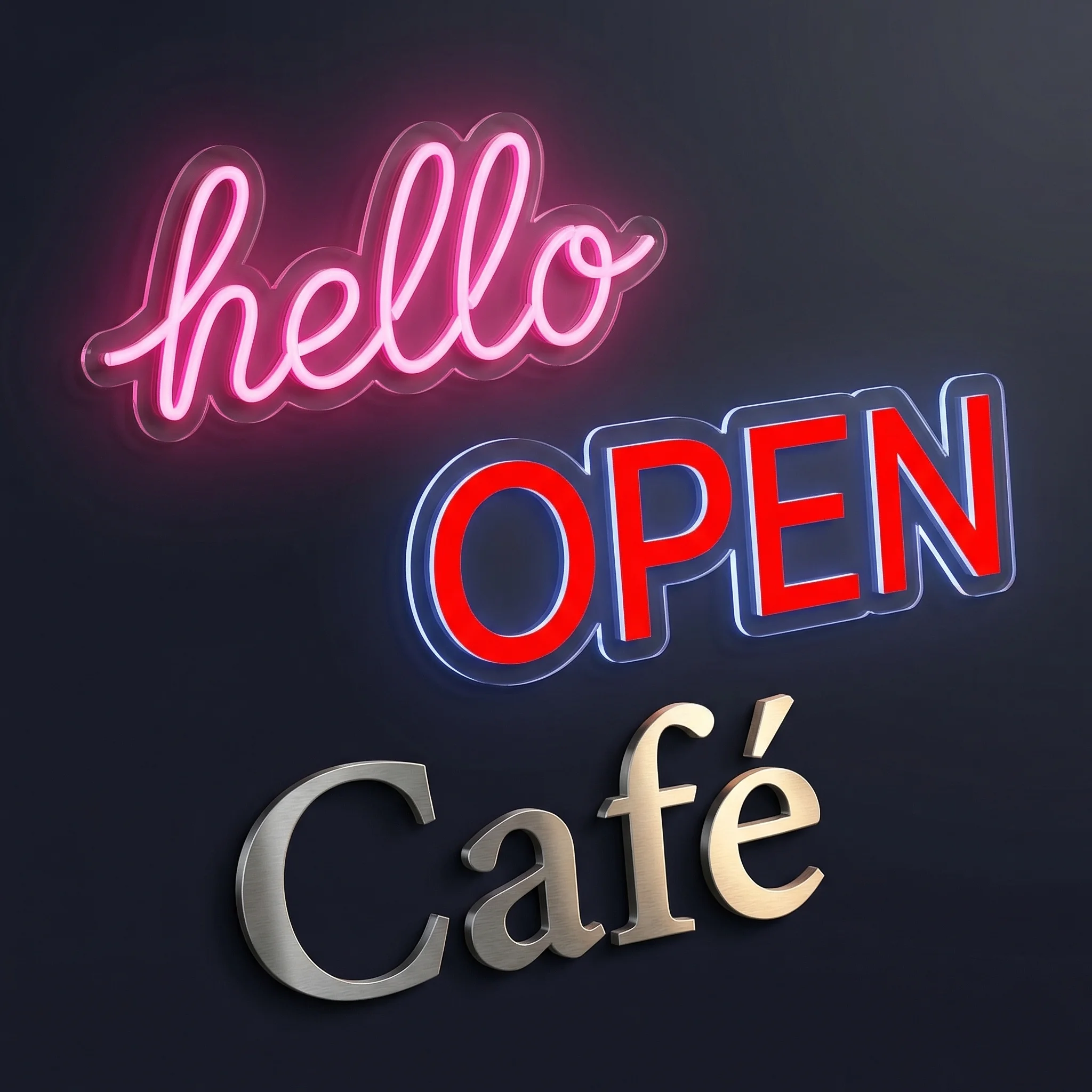
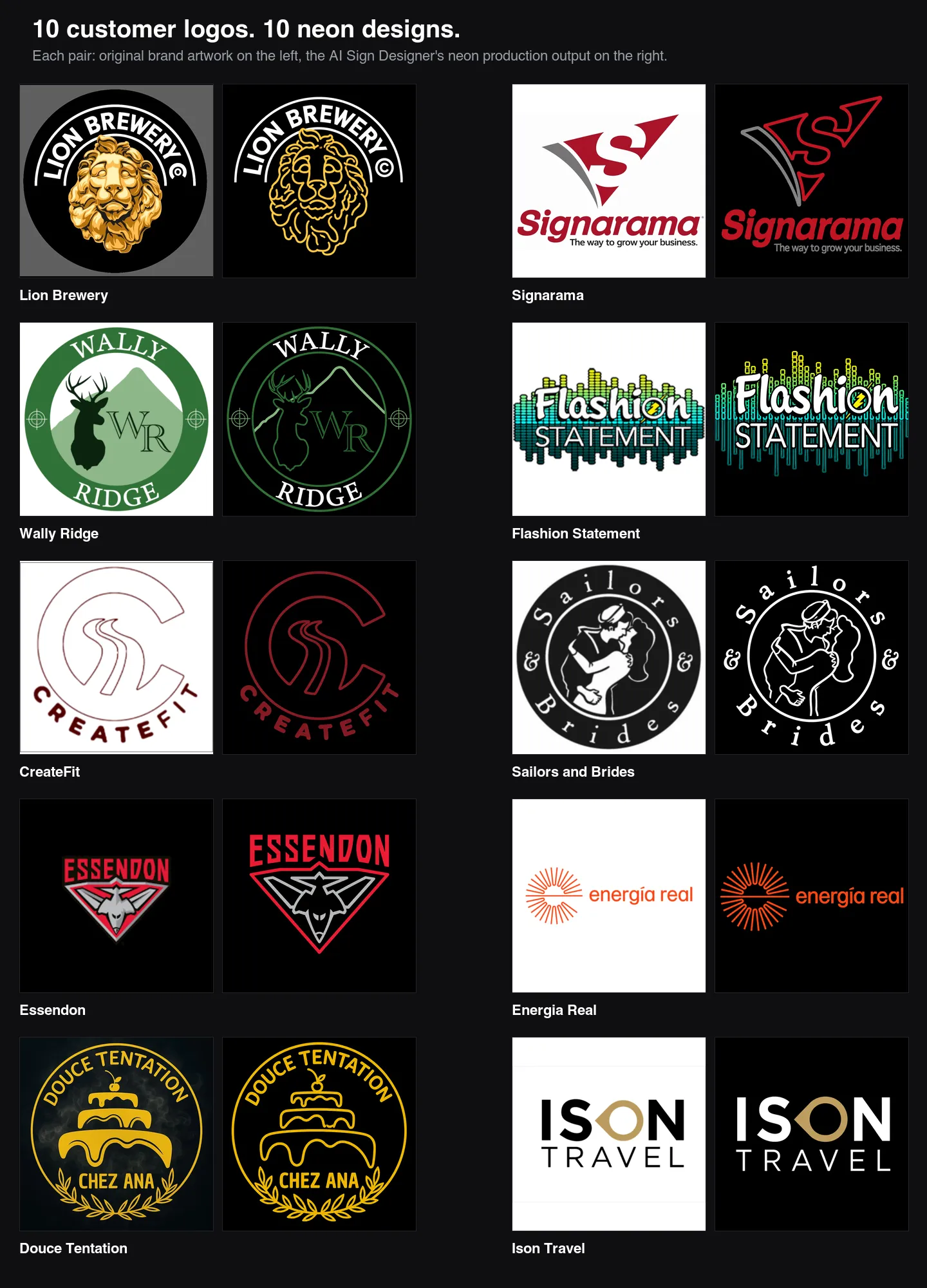
The AI Sign Designer has taken a significant step forward at converting customer-supplied logos into neon production artwork. When shoppers upload a brand logo and ask for a neon sign, the output now looks like a clean tube layout your shop could quote and build, with the original wordmark, colours, and proportions intact.
What’s Changed
- Brand typography is now preserved exactly - Wordmarks are traced from the original glyphs, so the source font weight, letter spacing, terminals, and curved baselines come through instead of being replaced by a generic neon script
- Source colours map to tube colours - Brand reds, greens, blues, and other colours from the customer’s logo carry through to the neon tubes rather than collapsing to a single white tube
- Backboards and filled badges are stripped out - Solid discs, shields, dark colour fields, and panel backgrounds behind a logo are removed automatically, leaving only the foreground tubes and lettering a sign shop would actually fabricate
- Flat production artwork instead of a glowing preview - Outputs are now unlit, hard-edged, vector-style tube proofs with no halos, bloom, or photographic glow effects, so what you see is what you’d quote
- Taglines and small lettering survive - Thin, light, or widely spaced text is no longer fattened or regularised; small straplines like “The way to grow your business” remain readable and on the right baseline
- Cleaner separation of text and graphics - Letters stay solid filled, while icons, animals, and decorative shapes are rebuilt as sparse tube paths with negative space between them — matching how a real neon sign is built
- More consistent results from the same upload - Neon prompts now run with tighter generation settings, so re-running the same logo produces noticeably less variation between attempts