NewTurn any image into a sign design.
Changelog

Changelog

Documenting our journey of creating a custom sign builder.

Filtered by:fix(21 updates)

Stay informed with updates every month

Or subscribe to ourRSS feed

Oct 7, 2026

2026.10

Inch and pound values stay as you enter them

Sign Customiser now keeps each size and weight rate in the unit that you use to enter it. Your Store can use inches, pounds, centimetres or kilograms. After you save and reload, the merchant admin shows the value that you entered. Before this update, the merchant admin changed an inch size to centimetres when you saved it, and the value could change. Every Store has this update. New Stores have it from the start.

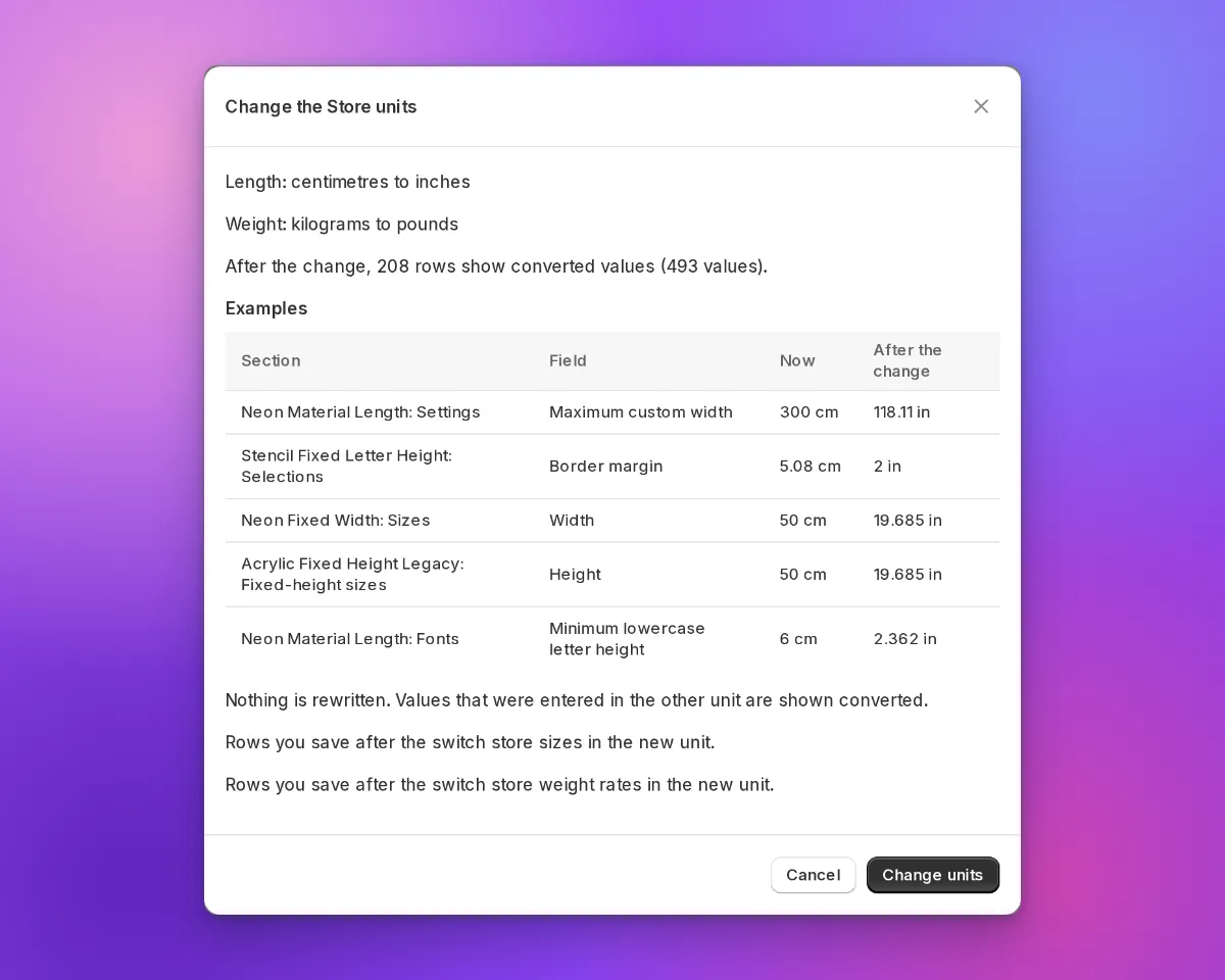
The Change the Store units dialogue with example values in centimetres now and in inches after the change

What’s Changed

  • Values stay in your Store unit. The merchant admin saves the size or weight rate that you enter, in your Store unit. It does not change the value to centimetres or kilograms first.
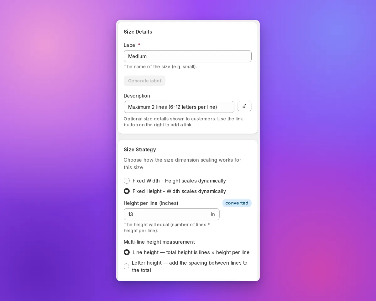
  • A “converted” marker shows values from the other unit. In a Store that uses inches or pounds, the merchant admin shows a converted marker next to a value from centimetres or kilograms.
  • Shoppers see your inch sizes. When a shopper reviews a design, the customer customiser shows the inch value that you entered for a preset size. It does not show a value that it calculates from centimetres. This does not apply to custom sizes, sizes with a border margin, or Advanced Letter and Frame Fit customisers.
  • Pound Stores send pounds to Shopify. If your Store uses pounds, Sign Customiser sends the weight from Add weight to product instead of calculating price to Shopify in pounds.
  • Preview a change of Store units. In Admin Settings, select the new units. Then select Review changes. The dialogue shows example values before and after the change. Sign Customiser does not change saved values. Values from the other unit show as converted.
  • API v3 and MCP use the two unit systems. The API and the curated MCP tools accept and return centimetre and inch fields, for example width_cm and width_in. Weight rates also have a price_per_lb field.
  • Prices round correctly at half a cent. A charge of $1.005 rounds to $1.01. The cart and product price is now the same as the price that the shopper sees. Before this fix, some products were one cent less than the shown price. This fix went live on 28 September 2026.
The Edit Size form in an inch Store with a converted marker next to Height per line

Read how to set your Store units for the steps. Read the earlier inch and pound update for the values that this update builds on.

Colour cards in the customiser sidebar

The customiser sidebar has a new layout for signs with more than one colour choice for their parts. Before, each choice was a small icon tile in a row. The name showed only in a tooltip and above the swatches of the selected choice.

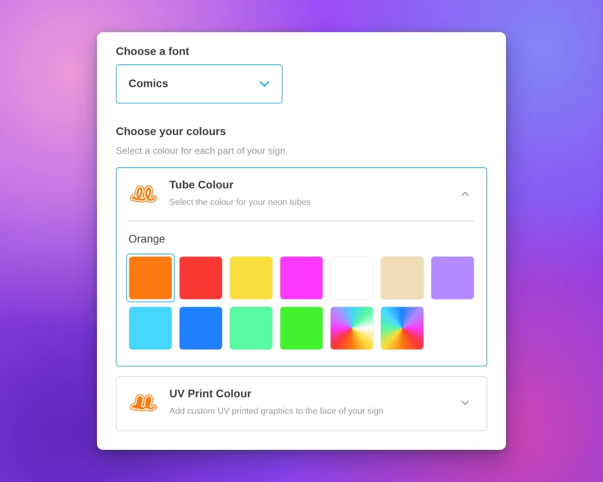
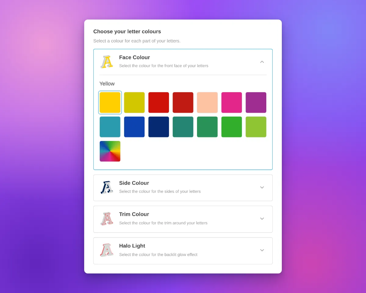
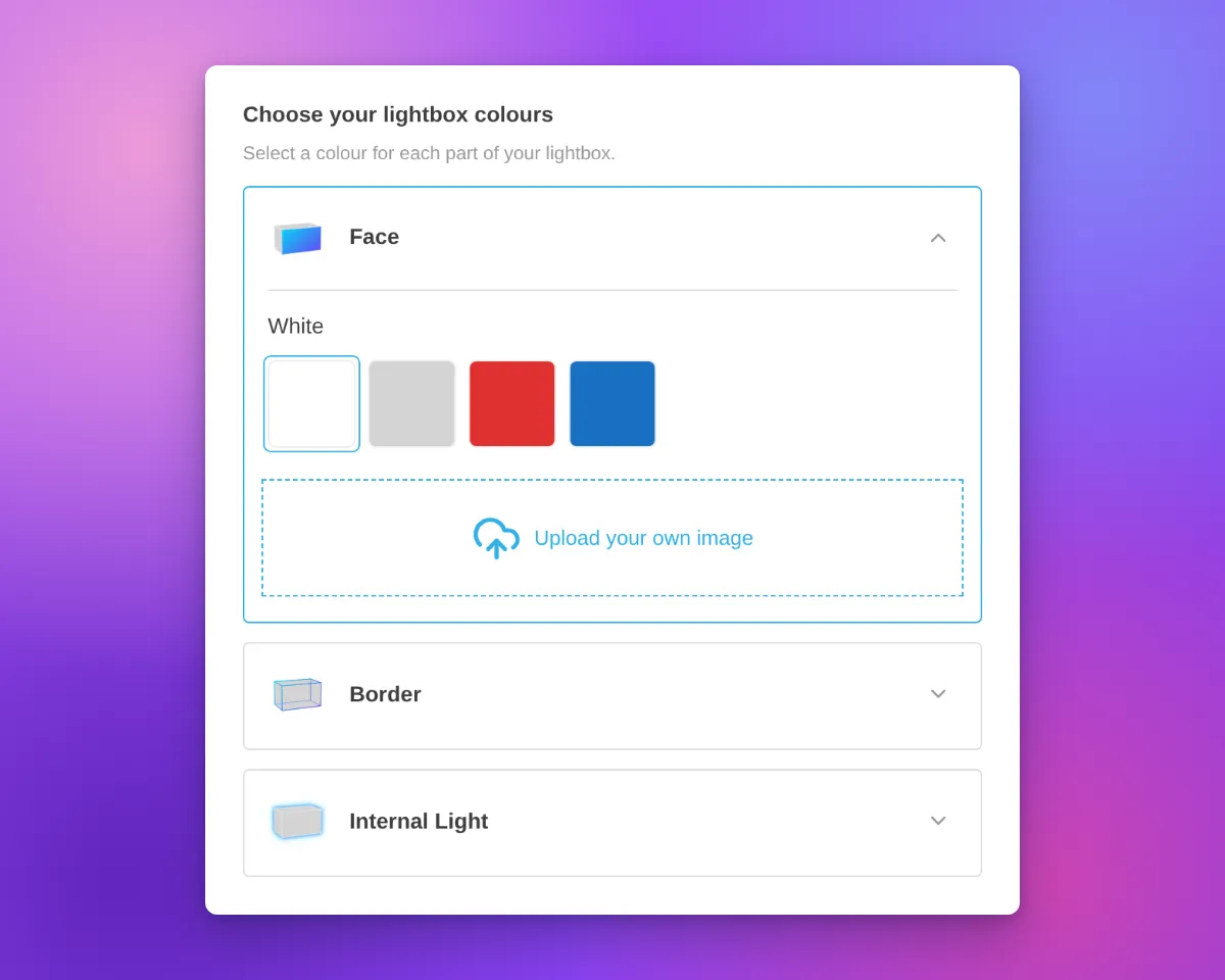
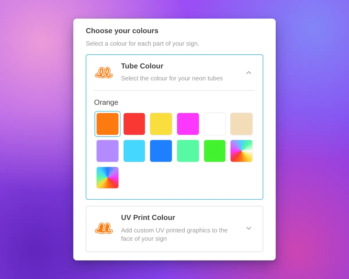
Now each colour choice has its own card. Most cards are for one part of the sign, such as the tube or the face. On a lightbox, the Face and Border parts can share one card when they have the same colour options. The card shows the name, an icon and an arrow. On neon and letter signs, the icon shows the current colour.

Only one card is open at a time. The open card contains the colour swatches for that choice. Customisers with only one colour choice for their parts keep the same colour section layout. Other colour sections, such as the backboard colour, also keep the same layout.

Neon customiser sidebar with the heading "Choose your colours", the Tube Colour card open to show its colour swatches, and the UV Print Colour card closed below it

Neon signs have new icons for the tube colour and UV print parts. The tube icon is a neon tube on a backboard outline. The UV print icon is the same backboard shape, filled with colour. Both icons change to the selected colour, including multi-colour options.

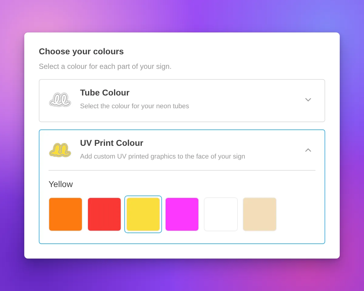
Icons in white and other very light colours have a thin grey outline. This outline keeps the icon visible on a white background. The Face, Side, Trim and Halo icons for letter signs also have this outline.

Neon customiser sidebar with the heading "Choose your colours", the UV Print Colour card open and Yellow selected, and a white tube icon with a thin grey outline on the closed Tube Colour card

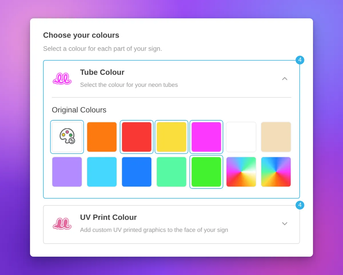
When a part uses more than one colour, the card shows a badge with the number of colours.

For designs from the AI sign designer, the Restore original colours swatch now shows a palette with a reset arrow. Its three paint spots show colours from the original design. When a part uses its original colours, the swatch is selected and the colour name is “Original Colours”. This applies to the tube, UV print, face, trim and halo parts.

Neon customiser sidebar for an AI sign designer design with the Restore original colours swatch selected, the colour name "Original Colours", and a badge with the number 4 on the Tube Colour and UV Print Colour cards

The cards are available on neon, letter and lightbox signs with more than one colour choice for their parts. In our demo customisers, acrylic channel letters have Face Colour, Side Colour, Trim Colour and Halo Light cards. Metal signs have Face / Front Lit and Back Lit cards. Lightboxes have Face, Border and Internal Light cards.

Most cards use the title and description you set for that colour part. If you do not set a title, the card uses a default part name. A shared Face and Border card shows the Face description.

Above the cards, the sidebar shows a heading with a title and a description. We added default text for neon, letter and lightbox signs. For example, neon signs show “Choose your colours”, letter signs show “Choose your letter colours” and lightboxes show “Choose your lightbox colours”. When the customiser shows step numbers, the heading has one step number for all the cards. If you set a title or a description before this update, we did not change it.

To change the heading, open the colour page of a sign part, for example Tube Colors or UV Colors. Then edit the Colour heading title and Colour heading description fields. All colour parts of a customiser use the same heading. On letter signs, you can also edit the heading on the Letter Types page. On lightboxes, you can also edit it on the Lightbox Types page. If you delete the text in both fields, the heading does not show.

Channel letter customiser sidebar with the heading "Choose your letter colours", Face Colour, Side Colour, Trim Colour and Halo Light cards, and the Face Colour card openLightbox customiser sidebar with the heading "Choose your lightbox colours", Face, Border and Internal Light cards, and the Face card open with colour swatches and an image upload area

On phones, the cards use the same layout. On phones and tablets, we also removed extra space above the first sidebar section. This space showed when a section above it was empty.

Neon customiser on a phone-width screen with the Tube Colour card open and the UV Print Colour card below it

What’s Changed

  • One card for each colour choiceEach colour choice for a sign part has a card with a name and an icon. On neon and letter signs, the icon shows the current colour. On a lightbox, the Face and Border parts can share one card.
  • One open card at a timeCustomers open a card to see its swatches. The other cards stay closed.
  • Colour headingA heading with a title and a description shows above the cards. Neon, letter and lightbox signs have default text. You can change or delete this text on the colour page of each sign part.
  • Your titles and descriptionsMost cards show the title and description that you set for each colour part.
  • New neon iconsThe tube colour and UV print parts have new neon icons that change to the selected colour.
  • Outline for light coloursNeon and letter sign icons in white and other very light colours have a thin grey outline.
  • Colour count badgeA card shows the number of colours when its part uses more than one colour.
  • Restore original colours swatchFor AI sign designer designs, the swatch shows colours from the original design. When a tube, UV print, face, trim or halo part uses its original colours, the swatch is selected and the name is “Original Colours”.
  • Single colour choiceA customiser with only one colour choice for its parts keeps the same colour section layout.
  • Phone and tablet spacingWe removed extra space above the first sidebar section when a section above it was empty.

Sep 25, 2026

2026.9

Clearer inch and pound figures across Sign Customiser

This update adds inch and pound values beside metric values in existing settings. The merchant admin still converts new size entries to centimetres when you save them. Enter 31 inches. The field shows 31 inches after you save and reload. Rates entered per pound keep the same figures.

What’s Changed

  • Whole inches stay whole. Existing size settings have an inch value beside the centimetre value. A saved whole-inch entry such as 31 inches displays as 31 inches.
  • Pound rates keep their figures. Pound-authored rates in this update display the same figures as before. One pound equals exactly 0.45359237 kilograms in calculations.
  • Divisors show full units. For volumetric shipping, the merchant admin shows the divisor you set with its unit. When the customer price breakdown is visible, it shows that divisor and the metric divisor used for calculations. Suggested starting values are 5000 cm³/kg, 139 in³/lb, and 2268 cm³/lb. The 305 in³/kg starting value comes from a calculation. It is not a carrier value. Use the divisor that your shipping carrier gives you.
  • Fixed Sign Depth can vary. For non-Lightbox volumetric pricing, enter a depth greater than zero at each size boundary. Later boundaries can use the same depth or a smaller depth.
  • Rates show their stored precision. The customer price breakdown displays per-unit rates without rounding them to two decimal places. Charges and totals still round to currency decimals.
  • New demos use round inches. New demo customisers for inch Stores use round inch sizes. The merchant admin rounds calculated parcel costs. It does not show long decimal tails.

Read the earlier inch and pound update and how to enter measurements in inches and pounds for more detail.

Sep 8, 2026

2026.9

Custom design upload and visualiser improvements

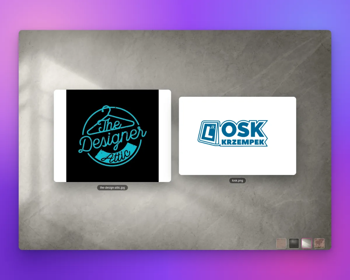
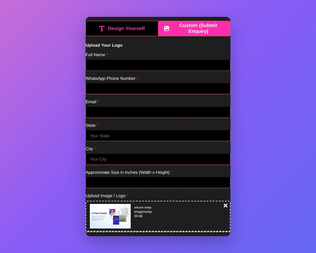
The desktop visualiser now shows uploaded designs large and centred. When scene backgrounds are available, it shows the selected scene behind them. Custom design forms also accept WebP, AVIF, GIF and BMP files. Shoppers get a clear message when a file type is not supported.

Two uploaded designs centred on a marble scene background in the custom design visualiserCustom design form showing an accepted WebP upload

What’s Changed

  • Show uploads on the stage. Display accepted images large and centred in the visualiser. Arrange multiple uploads side by side and show the file name below each preview.
  • Use scene backgrounds. Display the selected scene behind uploaded designs. Show background choices on desktop when a merchant enables more than one scene background. Do not show these choices for lightbox customisers.
  • Accept more image files. Accept WebP, AVIF, GIF and BMP uploads on every custom design form. Keep each file in the shopper’s original format.
  • Show clear file errors. Show a merchant-editable message on the file field when a file type is not supported. Keep the general submission error for other failures.
  • Show document file types. Show an extension badge for PDF, AI and EPS files when an image preview is not available.
  • Cover every custom design form. Apply the upload and preview improvements to customisers with custom design forms for every sign product type.

Default scene background sizing and product image fixes

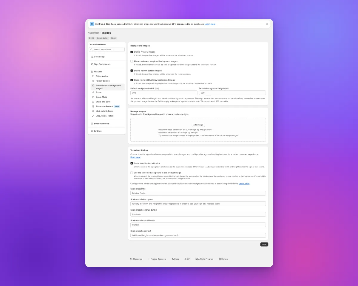
Sign Customiser keeps the built-in blue/grey background consistent for compatible sign customisers. Select it and enable “Use the selected background in the product image” to carry it into cart and order product images. Enter a positive real width to scale the visualiser and Review screen, then use the same option to scale the cart and order image. Without saved dimensions, the sign keeps its usual fit, while an enabled product-image option still uses the selected built-in colour.

Scene Editor showing default background size fields and visualiser scaling

What’s Changed

  • Set the default background size. In the Scene Editor, enter a positive width under “Display default blue/gray background image”. You can also save a height, but the width drives proportional scaling. The fields show when preview or Review images and the default background are enabled. “Scale visualisation with size” must be on, and Drag, Scale and Rotate must be off. They start blank, with 300 cm as a recommended placeholder.
  • Scale every preview consistently. With “Scale visualisation with size” on and a positive default background width, the visualiser and Review screen scale the sign against the built-in background. Enable “Use the selected background in the product image” for compatible customisers to scale cart and order product images too. Leave the fields blank to keep the usual fit.
  • Keep product images on the chosen backdrop. With “Use the selected background in the product image” enabled, supported non-Lightbox Konva customisers show the selected built-in background as a flat colour in product images. This includes Neon, Channel, cut-out, stencil and wooden sign types. This replaces the previous fallback image, including the demonstration photo when no Main Product Image is configured.
  • Keep Material Length sizes in order. Advanced Letter (Material Length) customisers with an unset size limit no longer show Medium or Large smaller than Small on backgrounds without dimensions. The Small preview stays the same.

Sign board previews now match every size

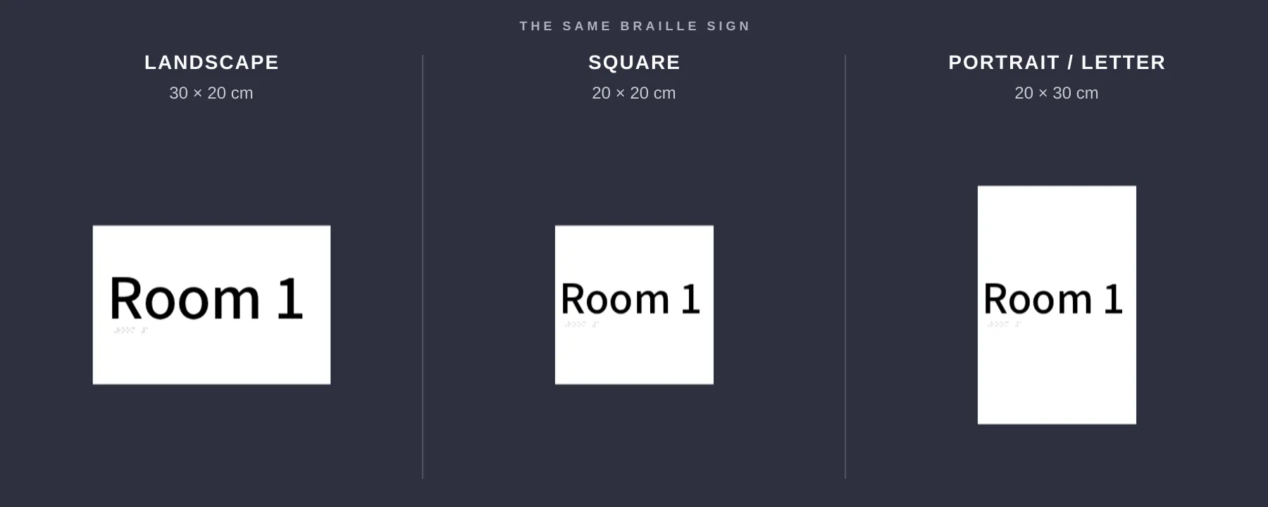
Sign Customiser now shows each rectangular sign board in the shape your customer selected. A square board stays square, while portrait and landscape formats look visibly different before the customer orders.

Three sign board previews showing landscape, square and portrait size proportions

What’s Changed

  • True-to-size previews. Square, portrait and landscape boards keep the width-to-height ratio the customer selects.
  • Accurate boxes and stands. Rectangular boxes and stands use the same proportions as the chosen sign size.
  • Matching product images. Newly generated product images keep the board shape customers saw while designing their sign.
  • Clearer measurements. Width and height guides line up with the board itself, making each format easier to compare.
  • No setup needed. Eligible customisers update automatically, and pricing stays the same.

Jul 22, 2026

2026.7

Stable custom CSS hooks across the customer customiser

Sign Customiser now gives merchants a stable CSS class for each part of the customer customiser. Existing custom CSS can target controls and states more precisely, without relying on generated class names that may change after an update.

What’s Changed

  • More complete CSS coverageStable classes now cover the customiser’s controls, forms, pricing details, previews, loading states and other visible elements
  • Reliable pop-up stylingModals, tooltips and popovers have dedicated classes, including elements that render outside the main customiser container
  • Predictable state selectorsSelected, open, active, disabled and error states use consistent class names where those states are available
  • Embed wrapper controlsShopify theme embeds and website integration wrappers now expose stable classes for their containers, loading screens, modals and validation messages
  • Safer saved CSSSign Customiser now handles merchant CSS and customiser setup data more safely when loading embedded, hosted and preview customisers

Jun 25, 2026

2026.6

Sell custom signs in every active Shopify market

If your Shopify store uses Markets to sell across multiple countries or regions, Sign Customiser now publishes each generated custom sign product to the shopper’s active market automatically. Previously a custom design could be created in a market where it wasn’t yet available for purchase, leaving some shoppers unable to complete checkout. Now the product is made available in the right market behind the scenes, so more customers reach the checkout no matter where they’re buying from.

What’s Changed

  • Automatic publishing to active marketsCustom sign products are now added to the catalogues of your active Shopify Markets when a design is created, so they’re available to buy in every region you sell to.
  • Guided Markets access setupA new banner in the Shopify admin lets stores using Markets approve the optional access Sign Customiser needs, with a single click and clear explanation of why it helps.
  • More reliable checkoutThe customiser and add-to-cart flow now stay resilient when market or cart information is incomplete, so shoppers still get a smooth path to checkout instead of an error.
  • Works quietly in the backgroundStores that don’t use Shopify Markets see no change, and there’s nothing extra to configure — everything happens automatically once access is approved.

Jun 22, 2026

2026.6

Reliable add to cart on Shopify's newest themes

Sign Customiser now adds custom signs to the cart correctly on Shopify’s newest theme family — Horizon and Vision, the successors to Dawn. Previously, when a shopper finished designing a sign on a store using one of these themes, the cart drawer wouldn’t open and the sign could be added twice, leaving customers with a doubled quantity and no confirmation that their design had been saved. Both issues are now resolved, so the add-to-cart experience is smooth and accurate across every supported theme.

What’s Changed

  • Support for Shopify Horizon and Vision themesCustom signs now add to the cart and slide open the cart drawer correctly on Shopify’s latest themes, giving shoppers instant confirmation that their design is saved.
  • No more doubled quantitiesA custom sign is now added to the cart exactly once on every theme, so customers always see the correct quantity and price at checkout.
  • Fewer abandoned cartsWith the cart drawer opening every time, shoppers are no longer left wondering whether their order went through, helping more designs make it to checkout.
  • Broader theme compatibilityWe reworked how the cart refreshes across Dawn, custom-built, and other themes so the cart panel always updates reliably without re-adding the product.

May 5, 2026

2026.5

Show which characters a font can't render

Sign Customiser now tells customers exactly which characters in their text the chosen font can’t render, instead of a generic “invalid characters” warning. The same check has been extended across every sign type and runs again at add-to-cart, so orders with unrenderable text can no longer slip through to the merchant.

What’s Changed

  • Specific character feedbackThe “invalid characters” message now lists the exact glyphs the font is missing, so customers know whether to fix a typo, swap a symbol, or pick a different font
  • Coverage across all sign typesFont glyph validation previously only ran for material-length pricing; it now runs for every sign that uses customer-typed text
  • Add-to-cart safety netIf an unsupported character slips past the live warning, the customiser now blocks add-to-cart and surfaces the same specific message, preventing unrenderable orders from reaching the merchant
  • Updated default labelThe default invalid-characters label includes a {characters} placeholder so merchants who customise the wording still see the offending characters listed in their own copy

Get started

Add Sign Customiserto your store today

Install now
36+ verified reviews

Login

Universal Sign In
  • WordPress
  • Wix
  • Etsy
  • Squarespace
  • Webflow

Or, if on Shopify, navigate to your store admin to login.