NewTurn any image into a sign design.
Changelog

Changelog

Documenting our journey of creating a custom sign builder.

Filtered by:metal(7 updates)

Stay informed with updates every month

Or subscribe to ourRSS feed

See the real size of a sign next to a person

The sign preview in Sign Customiser has a new Real size view. The view shows the customer’s sign next to a person who is 170 cm (5 ft 7 in) tall. The sign and the person have the same scale. Customers can see how big the sign is before they order it.
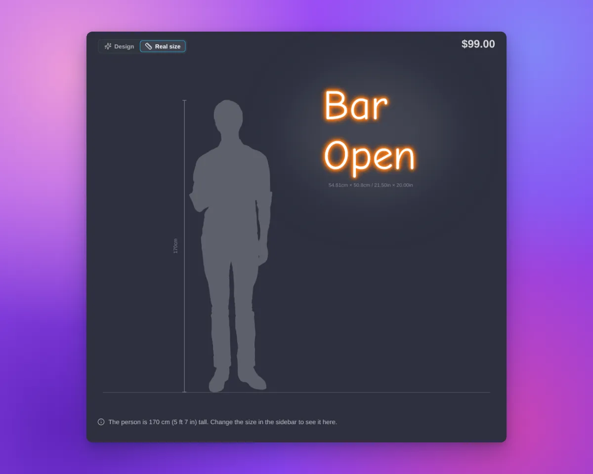
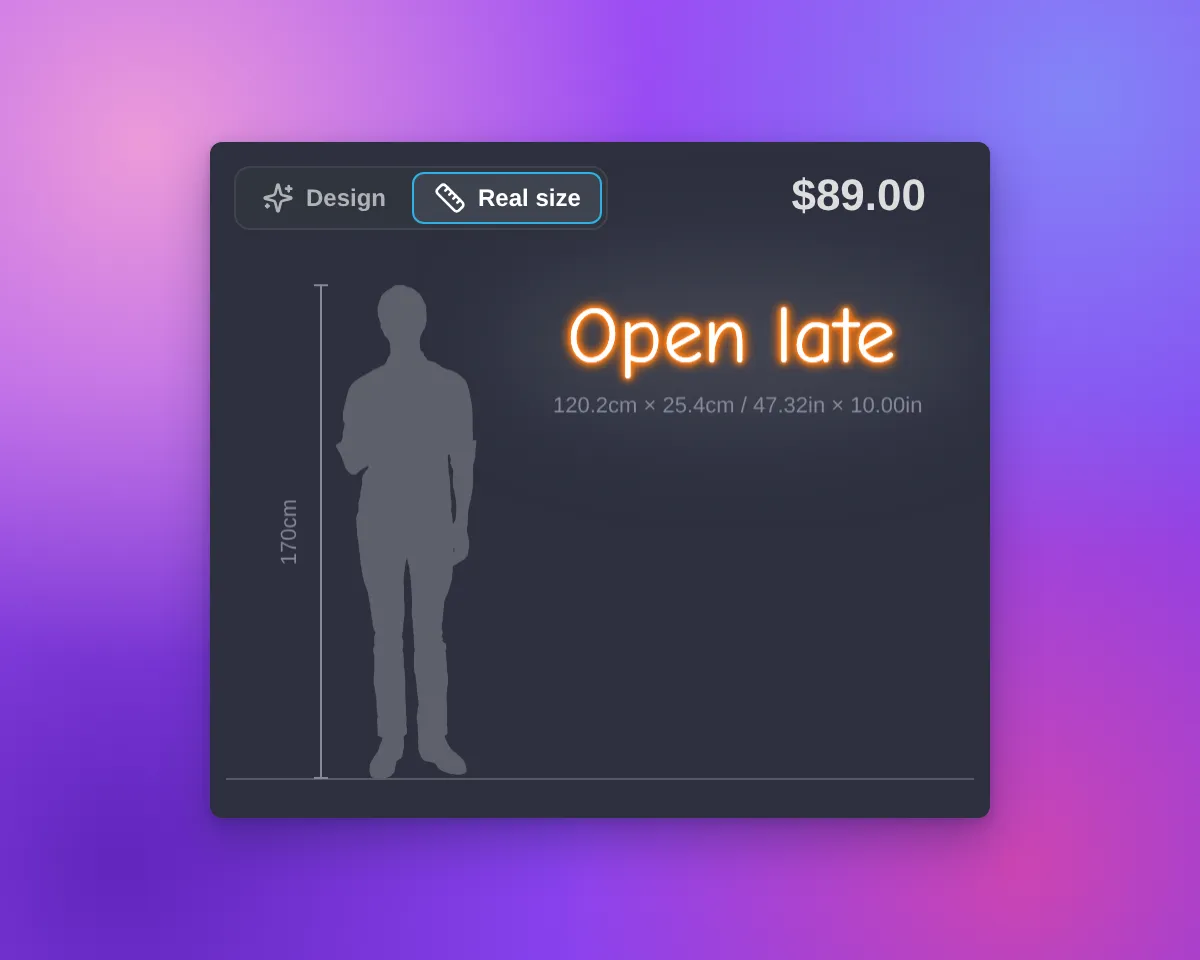
Real size view on desktop with a neon cut-to-letter sign next to a person silhouette and a height railReal size view on a phone with a neon cut-to-letter sign next to a person silhouette and a height rail

What’s Changed

  • Design | Real size switchThe switch is at the top left of the preview. The view opens only when a customer selects “Real size”. When the customer selects “Design”, the preview shows the design and the background again, with the sign in the centre.
  • One scaleThe Real size view uses the final width and height of the sign. This is the same size that the measurements on the preview show. The sign is on a wall next to the person, with a floor line and a height rail.
  • All sign shapesSquare, wide, tall and small signs fit in the preview on desktop and on phones. If the preview is too small, the “Real size” option shows a message.
  • Text signs and AI designsThe Real size view works for text signs and for designs from the AI sign designer.
  • Tools hiddenIn the Real size view, the preview does not show the tool buttons, “Share my design”, “Upload Background” or the backgrounds. The sidebar stays available. When the customer changes the size, the view shows the change.
  • Your measurement settingsThe size label of the sign follows your “Show/hide Measurements” setting. The height of the person and the size of the sign use your “Measurement Unit” setting.
  • On for new customisersNew customisers show the switch, except lightbox customisers. Customisers that you already have do not show it until you select the option. A duplicate customiser keeps the setting of the original customiser.
  • Where to find the optionOpen your customiser. Go to “Features → Scene Editor - Background Images”. In the “Visualiser Scaling” section, select “Show Real size view”. Click “Save”. You can use this option on every plan and with “Drag, Scale, Rotate”.
  • Your own wordsYou can change and translate the switch labels, the caption and the messages. They are in the “Visualiser” section of each language, in “Settings → Languages” of your customiser.
  • Not for lightbox signsThe Real size view is not available for lightbox signs.
  • Live preview onlyProduct images, the cart and shared design links show only the sign. They do not show the person.

For the full steps, read the Real size view article.
Colour cards in the customiser sidebar

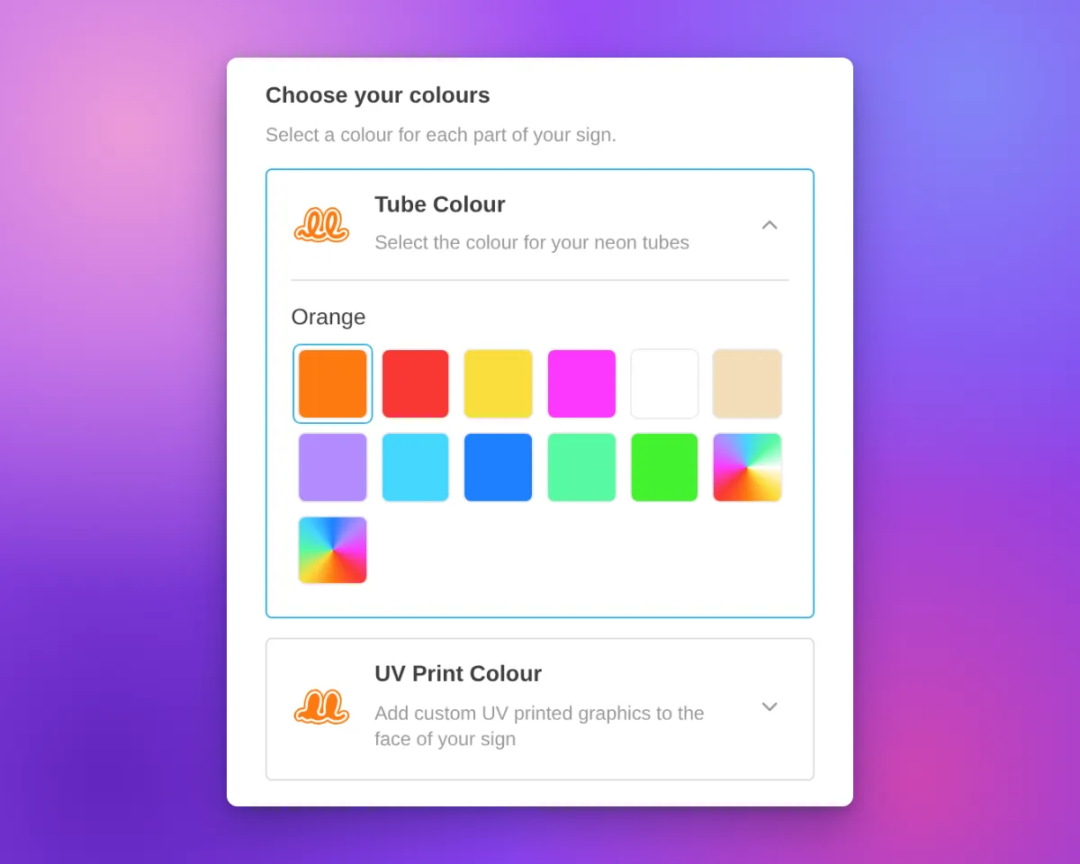
The customiser sidebar has a new layout for signs with more than one colour choice for their parts. Before, each choice was a small icon tile in a row. The name showed only in a tooltip and above the swatches of the selected choice.

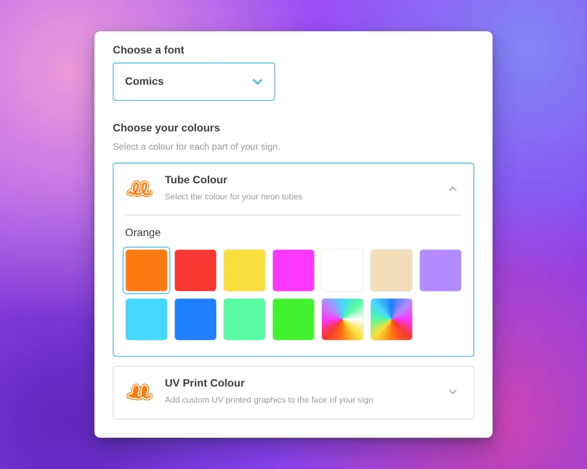
Now each colour choice has its own card. Most cards are for one part of the sign, such as the tube or the face. On a lightbox, the Face and Border parts can share one card when they have the same colour options. The card shows the name, an icon and an arrow. On neon and letter signs, the icon shows the current colour.

Only one card is open at a time. The open card contains the colour swatches for that choice. Customisers with only one colour choice for their parts keep the same colour section layout. Other colour sections, such as the backboard colour, also keep the same layout.

Neon customiser sidebar with the heading "Choose your colours", the Tube Colour card open to show its colour swatches, and the UV Print Colour card closed below it

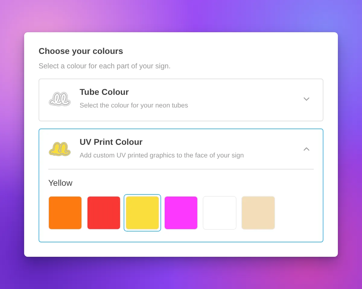
Neon signs have new icons for the tube colour and UV print parts. The tube icon is a neon tube on a backboard outline. The UV print icon is the same backboard shape, filled with colour. Both icons change to the selected colour, including multi-colour options.

Icons in white and other very light colours have a thin grey outline. This outline keeps the icon visible on a white background. The Face, Side, Trim and Halo icons for letter signs also have this outline.

Neon customiser sidebar with the heading "Choose your colours", the UV Print Colour card open and Yellow selected, and a white tube icon with a thin grey outline on the closed Tube Colour card

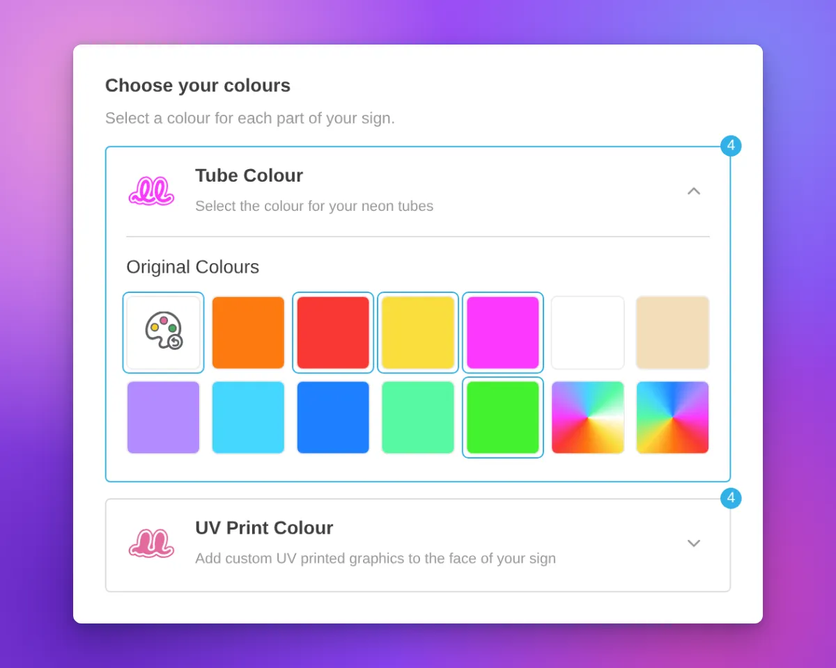
When a part uses more than one colour, the card shows a badge with the number of colours.

For designs from the AI sign designer, the Restore original colours swatch now shows a palette with a reset arrow. Its three paint spots show colours from the original design. When a part uses its original colours, the swatch is selected and the colour name is “Original Colours”. This applies to the tube, UV print, face, trim and halo parts.

Neon customiser sidebar for an AI sign designer design with the Restore original colours swatch selected, the colour name "Original Colours", and a badge with the number 4 on the Tube Colour and UV Print Colour cards

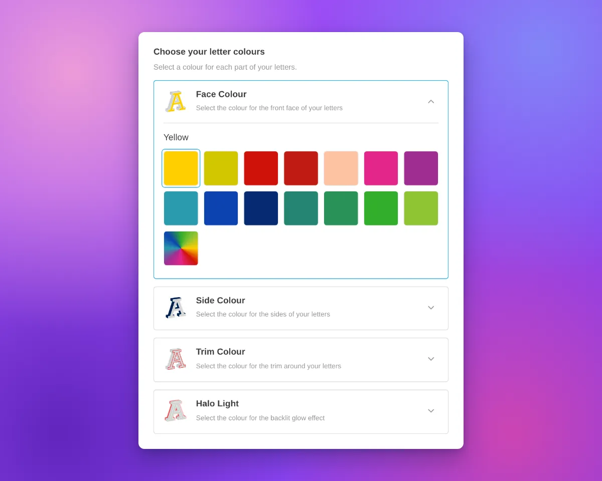
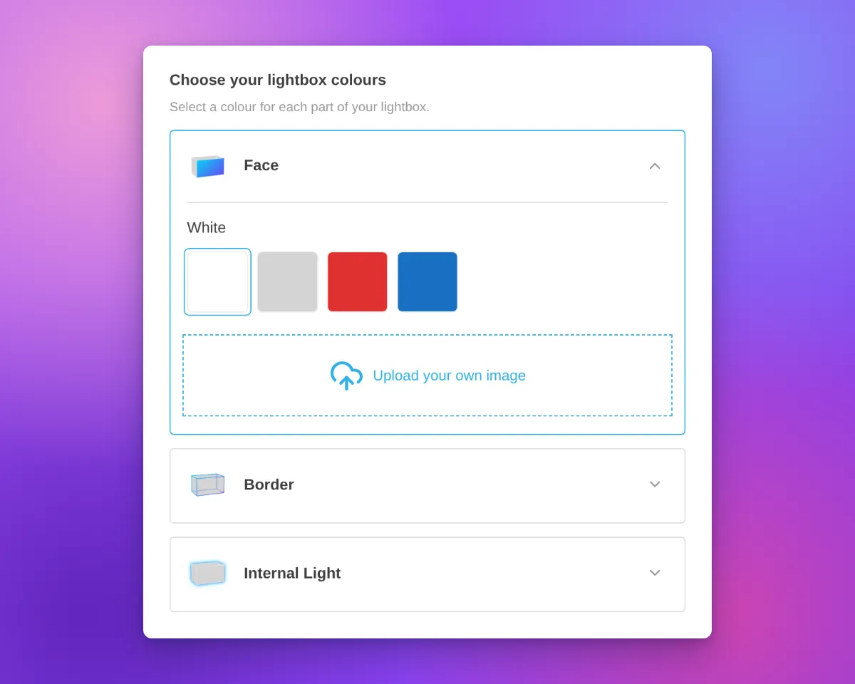
The cards are available on neon, letter and lightbox signs with more than one colour choice for their parts. In our demo customisers, acrylic channel letters have Face Colour, Side Colour, Trim Colour and Halo Light cards. Metal signs have Face / Front Lit and Back Lit cards. Lightboxes have Face, Border and Internal Light cards.

Most cards use the title and description you set for that colour part. If you do not set a title, the card uses a default part name. A shared Face and Border card shows the Face description.

Above the cards, the sidebar shows a heading with a title and a description. We added default text for neon, letter and lightbox signs. For example, neon signs show “Choose your colours”, letter signs show “Choose your letter colours” and lightboxes show “Choose your lightbox colours”. When the customiser shows step numbers, the heading has one step number for all the cards. If you set a title or a description before this update, we did not change it.

To change the heading, open the colour page of a sign part, for example Tube Colors or UV Colors. Then edit the Colour heading title and Colour heading description fields. All colour parts of a customiser use the same heading. On letter signs, you can also edit the heading on the Letter Types page. On lightboxes, you can also edit it on the Lightbox Types page. If you delete the text in both fields, the heading does not show.

Channel letter customiser sidebar with the heading "Choose your letter colours", Face Colour, Side Colour, Trim Colour and Halo Light cards, and the Face Colour card openLightbox customiser sidebar with the heading "Choose your lightbox colours", Face, Border and Internal Light cards, and the Face card open with colour swatches and an image upload area

On phones, the cards use the same layout. On phones and tablets, we also removed extra space above the first sidebar section. This space showed when a section above it was empty.

Neon customiser on a phone-width screen with the Tube Colour card open and the UV Print Colour card below it

What’s Changed

  • One card for each colour choiceEach colour choice for a sign part has a card with a name and an icon. On neon and letter signs, the icon shows the current colour. On a lightbox, the Face and Border parts can share one card.
  • One open card at a timeCustomers open a card to see its swatches. The other cards stay closed.
  • Colour headingA heading with a title and a description shows above the cards. Neon, letter and lightbox signs have default text. You can change or delete this text on the colour page of each sign part.
  • Your titles and descriptionsMost cards show the title and description that you set for each colour part.
  • New neon iconsThe tube colour and UV print parts have new neon icons that change to the selected colour.
  • Outline for light coloursNeon and letter sign icons in white and other very light colours have a thin grey outline.
  • Colour count badgeA card shows the number of colours when its part uses more than one colour.
  • Restore original colours swatchFor AI sign designer designs, the swatch shows colours from the original design. When a tube, UV print, face, trim or halo part uses its original colours, the swatch is selected and the name is “Original Colours”.
  • Single colour choiceA customiser with only one colour choice for its parts keeps the same colour section layout.
  • Phone and tablet spacingWe removed extra space above the first sidebar section when a section above it was empty.

Default scene background sizing and product image fixes

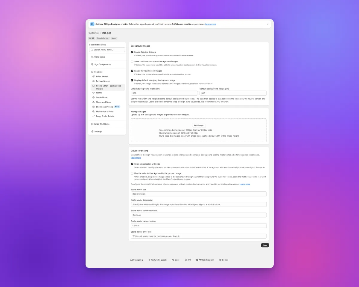
Sign Customiser keeps the built-in blue/grey background consistent for compatible sign customisers. Select it and enable “Use the selected background in the product image” to carry it into cart and order product images. Enter a positive real width to scale the visualiser and Review screen, then use the same option to scale the cart and order image. Without saved dimensions, the sign keeps its usual fit, while an enabled product-image option still uses the selected built-in colour.

Scene Editor showing default background size fields and visualiser scaling

What’s Changed

  • Set the default background size. In the Scene Editor, enter a positive width under “Display default blue/gray background image”. You can also save a height, but the width drives proportional scaling. The fields show when preview or Review images and the default background are enabled. “Scale visualisation with size” must be on, and Drag, Scale and Rotate must be off. They start blank, with 300 cm as a recommended placeholder.
  • Scale every preview consistently. With “Scale visualisation with size” on and a positive default background width, the visualiser and Review screen scale the sign against the built-in background. Enable “Use the selected background in the product image” for compatible customisers to scale cart and order product images too. Leave the fields blank to keep the usual fit.
  • Keep product images on the chosen backdrop. With “Use the selected background in the product image” enabled, supported non-Lightbox Konva customisers show the selected built-in background as a flat colour in product images. This includes Neon, Channel, cut-out, stencil and wooden sign types. This replaces the previous fallback image, including the demonstration photo when no Main Product Image is configured.
  • Keep Material Length sizes in order. Advanced Letter (Material Length) customisers with an unset size limit no longer show Medium or Large smaller than Small on backgrounds without dimensions. The Small preview stays the same.

Sign board previews now match every size

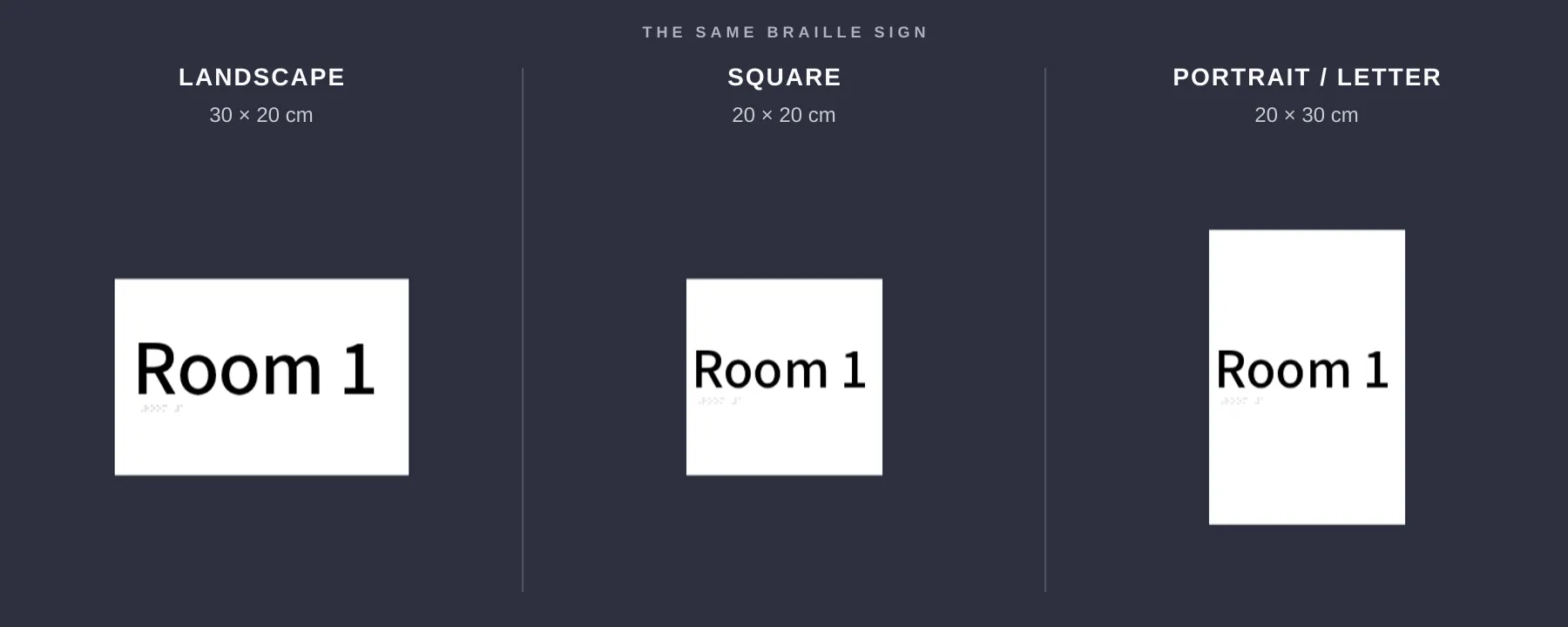
Sign Customiser now shows each rectangular sign board in the shape your customer selected. A square board stays square, while portrait and landscape formats look visibly different before the customer orders.

Three sign board previews showing landscape, square and portrait size proportions

What’s Changed

  • True-to-size previews. Square, portrait and landscape boards keep the width-to-height ratio the customer selects.
  • Accurate boxes and stands. Rectangular boxes and stands use the same proportions as the chosen sign size.
  • Matching product images. Newly generated product images keep the board shape customers saw while designing their sign.
  • Clearer measurements. Width and height guides line up with the board itself, making each format easier to compare.
  • No setup needed. Eligible customisers update automatically, and pricing stays the same.

Categorised Shopify product types for generated signs

Sign Customiser now gives each newly generated Shopify product a product type that matches its sign category. This makes it easier to build collections, shipping rules and other Shopify automations for different kinds of signs.

What’s Changed

  • Product types now match the signNew acrylic, metal, stencil, wooden, aluminium, braille, wood-frame and lightbox products receive their own clear product type.
  • Neon remains familiarNew neon products keep the existing Custom Neon product type, so established neon workflows continue to work.
  • Existing products stay unchangedThe new product types apply when Sign Customiser creates a product. Products already in Shopify are not renamed.

Jun 23, 2026

2026.6

Backlit glow for cut-out metal signs

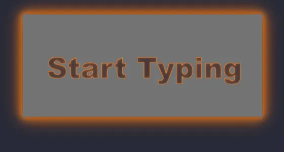
Sign Customiser now lets you offer a backlit glow on cut-out metal sign customisers. Add a backlight option and your customers can switch the lighting on, pick a colour, and watch the preview update live — light blooming around the panel edge and through the inside of every cut-out shape, just like a real LED-backlit sign lit up against a wall.

Cut-out metal sign reading "Start Typing" with an amber backlit glow around the panel edge and the inside of each cut-out letter

The same glow follows any design. Whether your customer types their own text or uploads a logo through the AI Sign Designer, the shape is cut from the panel and lit around every edge.

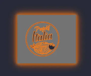
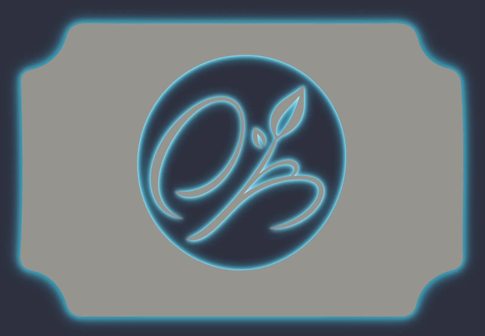
Cut-out metal panel with an AI Sign Designer logo punched out and an amber backlit glow tracing the panel edge and the inside of the logoCut-out metal sign with a circular monogram logo cut from the panel, lit by a blue backlit glow around the panel edge and through the cut-out design

What’s Changed

  • New backlight optionAdd a backlight selection to any cut-out metal customiser so customers can choose to light their sign up.
  • A range of glow coloursOffer warm white, amber and other single colours, or multi-colour RGB and Flow effects — each with its own optional price adjustment.
  • Works for text and logosCustomer-typed text and AI Sign Designer logos are both cut from the panel, with the glow tracing every edge of the design.
  • True-to-life glow previewThe light blooms softly out from the panel edge and the inside edge of every cut-out shape, with see-through centres, instead of a hard painted outline.
  • Carried right through to the orderThe selected backlight and its price flow into the live quote, the product image, the cart and the manufacturer’s order details.

Metal cut-out signs

Sign Customiser now ships a dedicated Metal Cut-Out Signs product type. Customers pick a panel shape and type or upload their design, and the sign is rendered as a clean negative-space cut-out from a metal panel — ready to send straight to the laser cutter.

New Metal Cut-Out Signs product card in the customiser create flow, with cut-out bear and mountain artwork

What’s Changed

  • New Metal Cut-Out Signs product typePick “Metal Cut-Out Signs” in the customiser create flow alongside neon, channel letters, lightbox, wood, and address numbers. Onboarding seeds a complete starter customiser with panels, panel colours, mountings, and an outdoor finishing extra so the new product is ready to sell as soon as it’s created
  • Six pre-built panel shapesRectangle, rounded rectangle, circle, oval, classic plaque, and banner panels are included out of the box, each with sensible text padding so the cut-out design always sits comfortably inside the panel edge
  • AI Sign Designer supportCustomers can upload a logo or describe the sign they want and the AI Sign Designer generates clean stencil-style artwork shaped to the selected panel, ready to be cut from metal in a single piece
  • Panel colour and material libraryA starter library of panel finishes — including raw steel — applies across the visualiser so shoppers see their cut-out design on the actual material they’ll receive
  • Mounting and finishing optionsWall standoffs and pre-cut hanging holes ship as mounting choices, with an optional outdoor clear coat extra for signs that need extra protection against the weather
  • Frame fit pricing built inCut-out signs use area-based frame fit pricing, so quotes scale naturally with panel size using the same pricing model already powering backboards and lightbox signs

Get started

Add Sign Customiserto your store today

Install now
36+ verified reviews

Login

Universal Sign In
  • WordPress
  • Wix
  • Etsy
  • Squarespace
  • Webflow

Or, if on Shopify, navigate to your store admin to login.