NewTurn any image into a sign design.
Changelog

Changelog

Documenting our journey of creating a custom sign builder.

Filtered by:feature(177 updates)

Stay informed with updates every month

Or subscribe to ourRSS feed

Oct 7, 2026

2026.10

Inch and pound values stay as you enter them

Sign Customiser now keeps each size and weight rate in the unit that you use to enter it. Your Store can use inches, pounds, centimetres or kilograms. After you save and reload, the merchant admin shows the value that you entered. Before this update, the merchant admin changed an inch size to centimetres when you saved it, and the value could change. Every Store has this update. New Stores have it from the start.

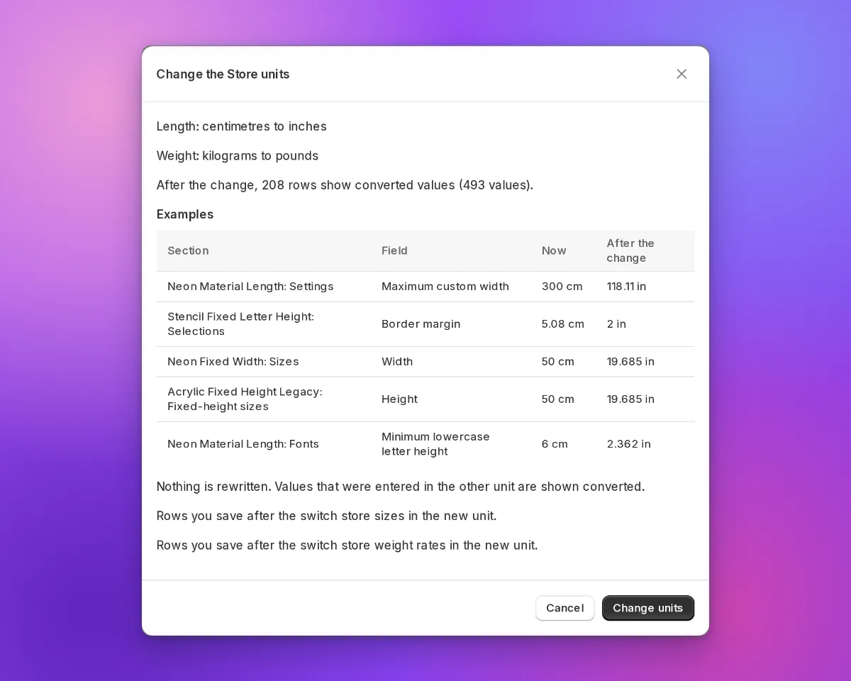
The Change the Store units dialogue with example values in centimetres now and in inches after the change

What’s Changed

  • Values stay in your Store unit. The merchant admin saves the size or weight rate that you enter, in your Store unit. It does not change the value to centimetres or kilograms first.
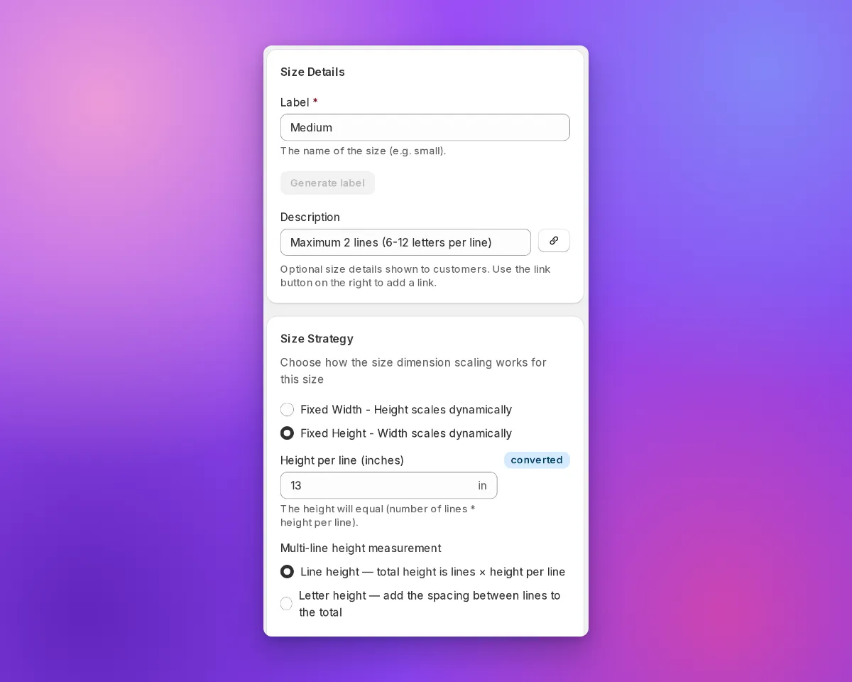
  • A “converted” marker shows values from the other unit. In a Store that uses inches or pounds, the merchant admin shows a converted marker next to a value from centimetres or kilograms.
  • Shoppers see your inch sizes. When a shopper reviews a design, the customer customiser shows the inch value that you entered for a preset size. It does not show a value that it calculates from centimetres. This does not apply to custom sizes, sizes with a border margin, or Advanced Letter and Frame Fit customisers.
  • Pound Stores send pounds to Shopify. If your Store uses pounds, Sign Customiser sends the weight from Add weight to product instead of calculating price to Shopify in pounds.
  • Preview a change of Store units. In Admin Settings, select the new units. Then select Review changes. The dialogue shows example values before and after the change. Sign Customiser does not change saved values. Values from the other unit show as converted.
  • API v3 and MCP use the two unit systems. The API and the curated MCP tools accept and return centimetre and inch fields, for example width_cm and width_in. Weight rates also have a price_per_lb field.
  • Prices round correctly at half a cent. A charge of $1.005 rounds to $1.01. The cart and product price is now the same as the price that the shopper sees. Before this fix, some products were one cent less than the shown price. This fix went live on 28 September 2026.
The Edit Size form in an inch Store with a converted marker next to Height per line

Read how to set your Store units for the steps. Read the earlier inch and pound update for the values that this update builds on.

Oct 6, 2026

2026.10

Shopify variant links open the correct size

Sign Customiser now reads the variant in a Shopify product link. The customer customiser then opens with the size of that variant selected. Google Shopping can show each variant of a Shopify product as a separate offer with its own link. A Shopify link to one variant has ?variant= in the URL. Before this update, a new design always started with the first size selected. Because of this, a shopper who clicked a larger size in Google saw the first size and its price.

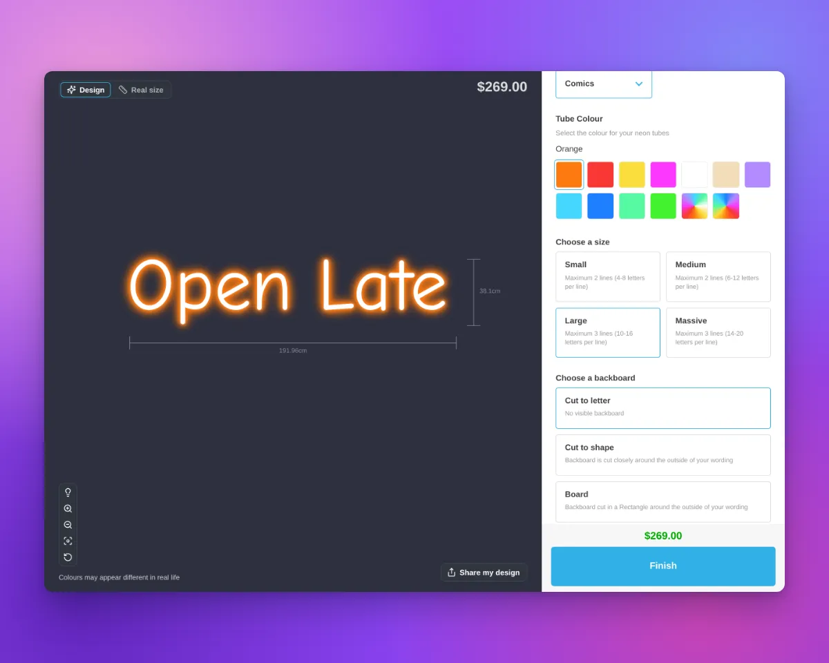
Neon customer customiser with the Large size selected under "Choose a size" and a price of $269.00
  • The customiser shows the size of the variant. When the product page URL has ?variant=, the customiser selects the size that has the same text as an option value of that variant. This applies to all sign types that have size options.
  • How an option value agrees with a size. An option value agrees with a size when it is the same as the size label, for example 30 inch. It also agrees when it is the size label, then the text of the size Description field in brackets, for example 30 inch (75 cm). Letter case and extra spaces have no effect. A typographic inch mark agrees with a straight inch mark, for example 30″ and 30".
  • The first size is the default. If no size agrees, or if more than one size agrees, the customiser selects the first size. This is the same as before.
  • Saved designs come first. When “Save sign design for next visit” is on, the customiser still opens the design from the last visit of the shopper. It also still opens a ShareLink or a preset. These designs come before the variant in the link.
  • Only the Sign Customiser app block. This function works on Shopify product pages that use the Sign Customiser app block. The Sign Customiser Modal block, the Sign Customiser - Embed app embed and the “Use iframe (experimental)” setting do not read the variant.

How to set it up

  1. In the merchant admin, find the Label field of each size in your customiser.
  2. Use one size label as an option value of each Shopify variant, for example 30 inch.
  3. If a size has a Description, add it in brackets after the label, for example 30 inch (75 cm).
  4. Make sure that each option value agrees with only one size.

See the real size of a sign next to a person

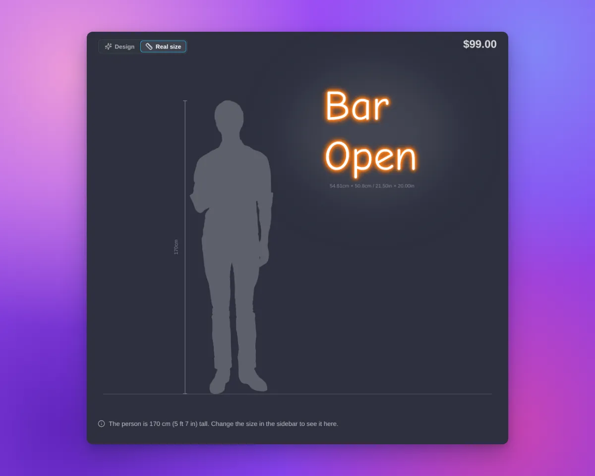
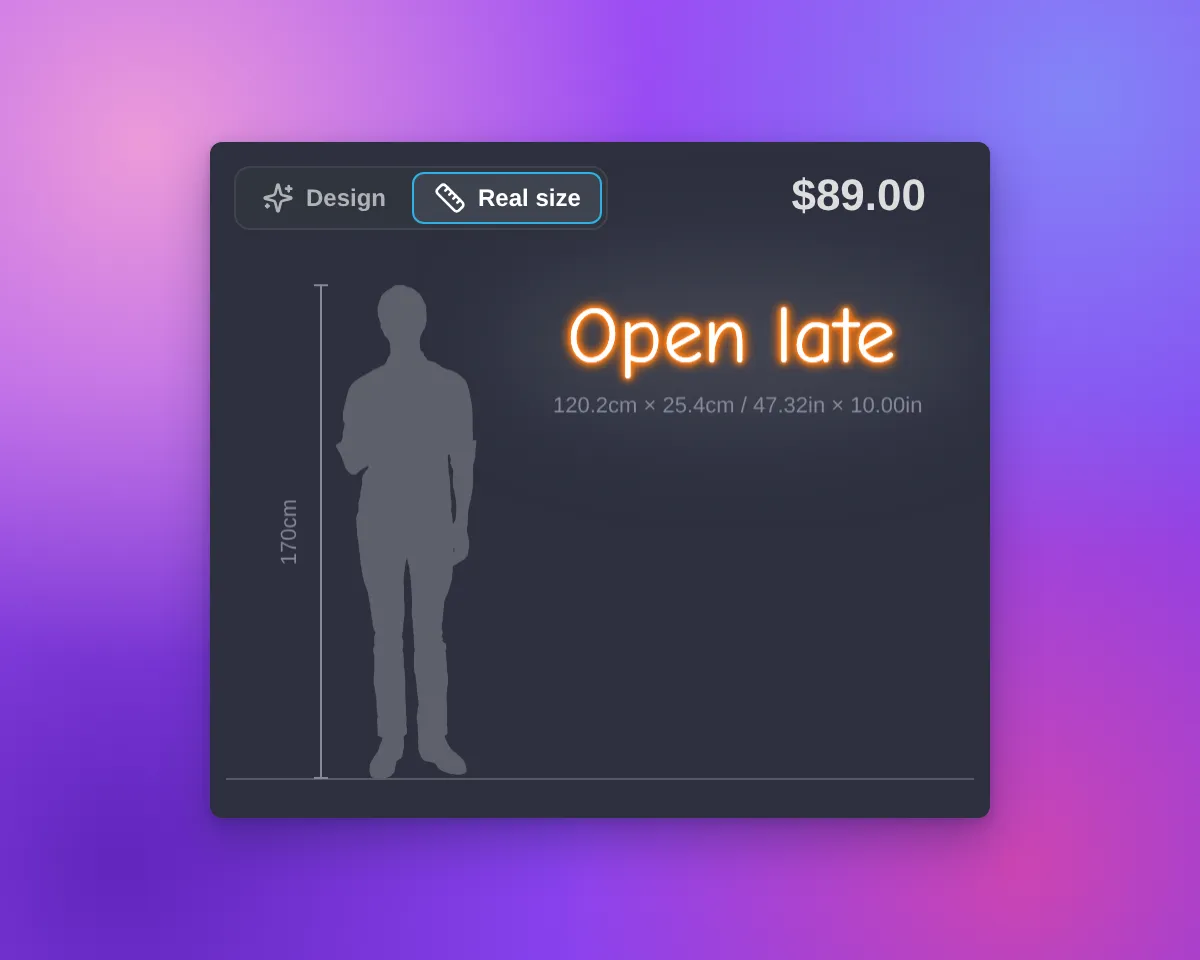
The sign preview in Sign Customiser has a new Real size view. The view shows the customer’s sign next to a person who is 170 cm (5 ft 7 in) tall. The sign and the person have the same scale. Customers can see how big the sign is before they order it.

Real size view on desktop with a neon cut-to-letter sign next to a person silhouette and a height railReal size view on a phone with a neon cut-to-letter sign next to a person silhouette and a height rail

What’s Changed

  • Design | Real size switchThe switch is at the top left of the preview. The view opens only when a customer selects “Real size”. When the customer selects “Design”, the preview shows the design and the background again, with the sign in the centre.
  • One scaleThe Real size view uses the final width and height of the sign. This is the same size that the measurements on the preview show. The sign is on a wall next to the person, with a floor line and a height rail.
  • All sign shapesSquare, wide, tall and small signs fit in the preview on desktop and on phones. If the preview is too small, the “Real size” option shows a message.
  • Text signs and AI designsThe Real size view works for text signs and for designs from the AI sign designer.
  • Tools hiddenIn the Real size view, the preview does not show the tool buttons, “Share my design”, “Upload Background” or the backgrounds. The sidebar stays available. When the customer changes the size, the view shows the change.
  • Your measurement settingsThe size label of the sign follows your “Show/hide Measurements” setting. The height of the person and the size of the sign use your “Measurement Unit” setting.
  • On for new customisersNew customisers show the switch, except lightbox customisers. Customisers that you already have do not show it until you select the option. A duplicate customiser keeps the setting of the original customiser.
  • Where to find the optionOpen your customiser. Go to “Features → Scene Editor - Background Images”. In the “Visualiser Scaling” section, select “Show Real size view”. Click “Save”. You can use this option on every plan and with “Drag, Scale, Rotate”.
  • Your own wordsYou can change and translate the switch labels, the caption and the messages. They are in the “Visualiser” section of each language, in “Settings → Languages” of your customiser.
  • Not for lightbox signsThe Real size view is not available for lightbox signs.
  • Live preview onlyProduct images, the cart and shared design links show only the sign. They do not show the person.

For the full steps, read the Real size view article.

Colour cards in the customiser sidebar

The customiser sidebar has a new layout for signs with more than one colour choice for their parts. Before, each choice was a small icon tile in a row. The name showed only in a tooltip and above the swatches of the selected choice.

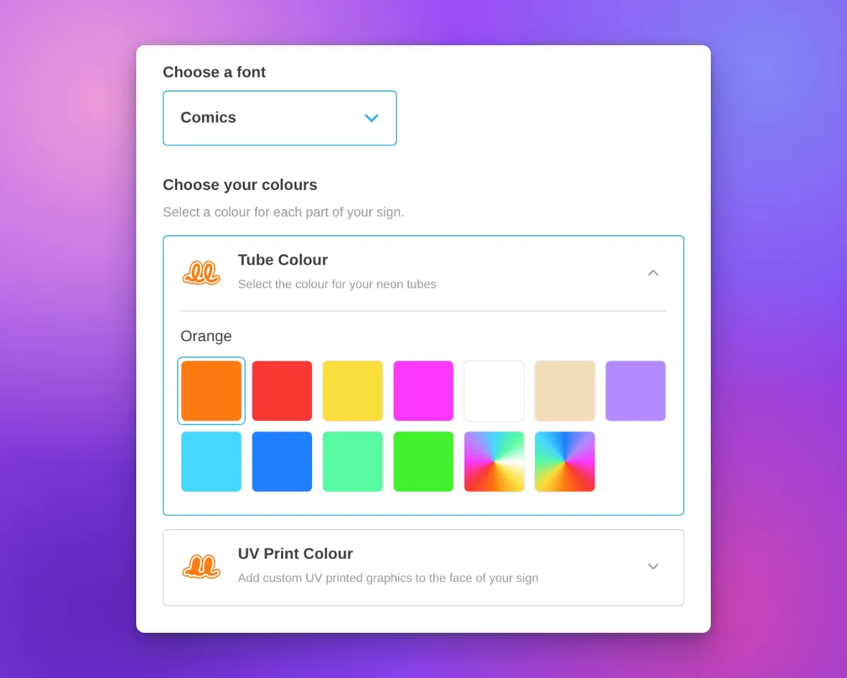
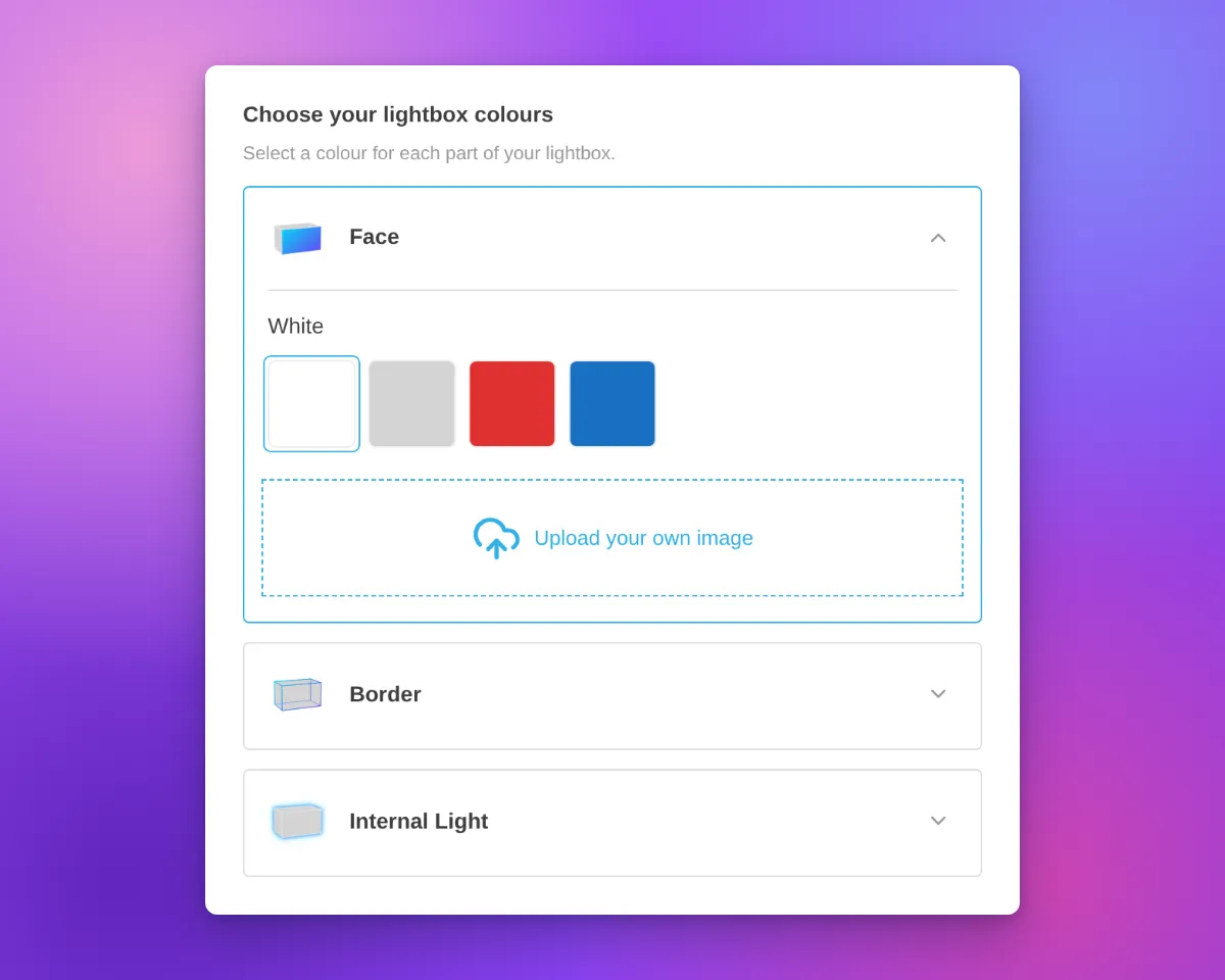
Now each colour choice has its own card. Most cards are for one part of the sign, such as the tube or the face. On a lightbox, the Face and Border parts can share one card when they have the same colour options. The card shows the name, an icon and an arrow. On neon and letter signs, the icon shows the current colour.

Only one card is open at a time. The open card contains the colour swatches for that choice. Customisers with only one colour choice for their parts keep the same colour section layout. Other colour sections, such as the backboard colour, also keep the same layout.

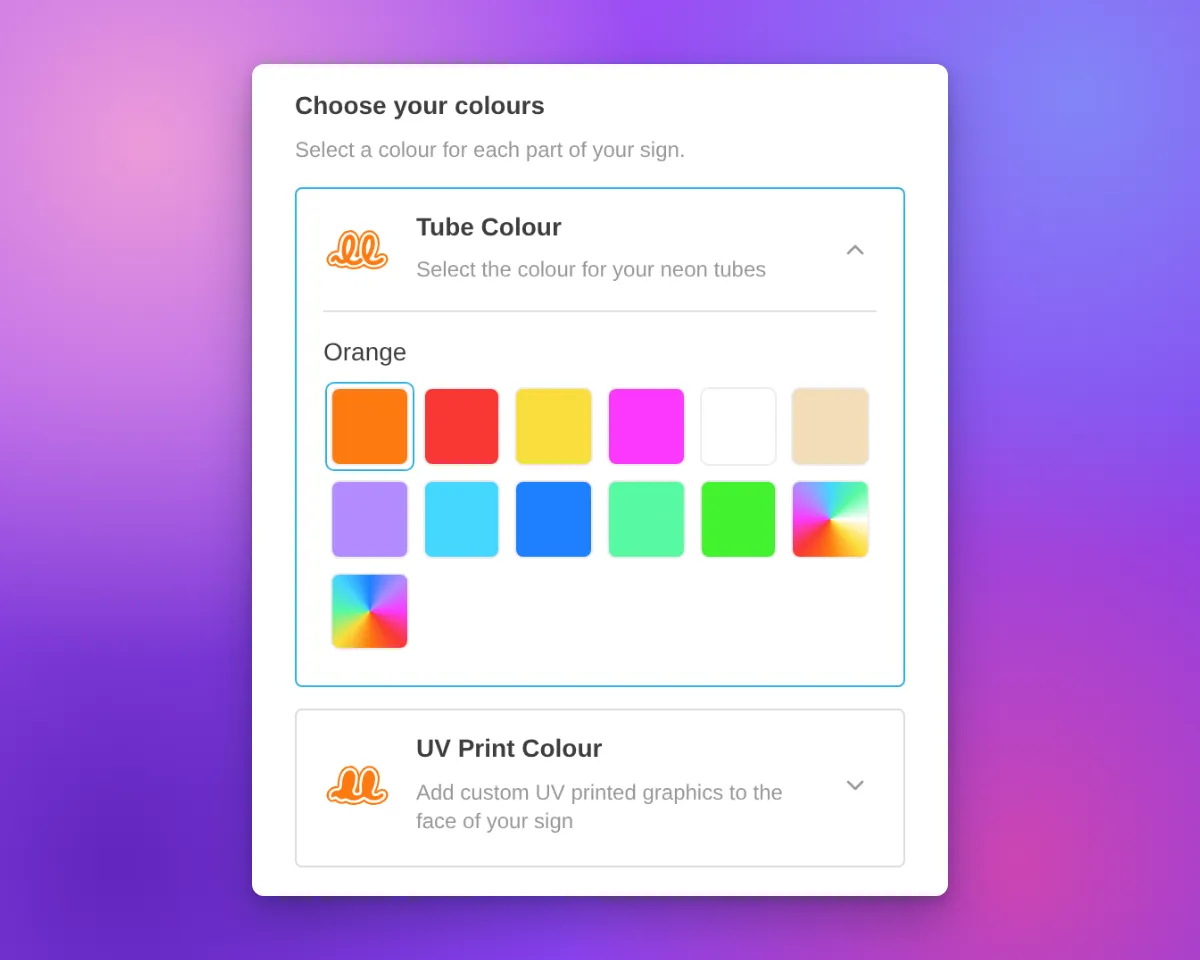
Neon customiser sidebar with the heading "Choose your colours", the Tube Colour card open to show its colour swatches, and the UV Print Colour card closed below it

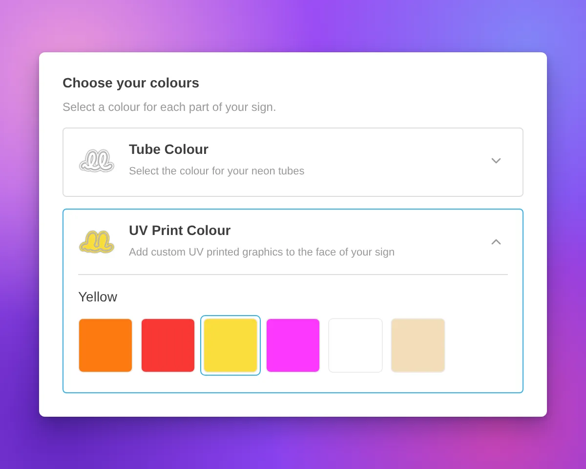
Neon signs have new icons for the tube colour and UV print parts. The tube icon is a neon tube on a backboard outline. The UV print icon is the same backboard shape, filled with colour. Both icons change to the selected colour, including multi-colour options.

Icons in white and other very light colours have a thin grey outline. This outline keeps the icon visible on a white background. The Face, Side, Trim and Halo icons for letter signs also have this outline.

Neon customiser sidebar with the heading "Choose your colours", the UV Print Colour card open and Yellow selected, and a white tube icon with a thin grey outline on the closed Tube Colour card

When a part uses more than one colour, the card shows a badge with the number of colours.

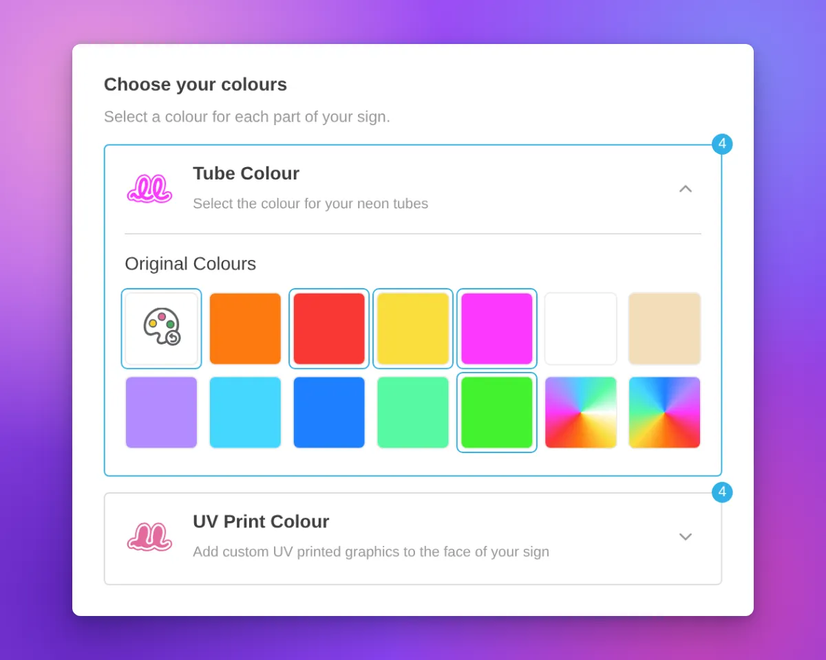
For designs from the AI sign designer, the Restore original colours swatch now shows a palette with a reset arrow. Its three paint spots show colours from the original design. When a part uses its original colours, the swatch is selected and the colour name is “Original Colours”. This applies to the tube, UV print, face, trim and halo parts.

Neon customiser sidebar for an AI sign designer design with the Restore original colours swatch selected, the colour name "Original Colours", and a badge with the number 4 on the Tube Colour and UV Print Colour cards

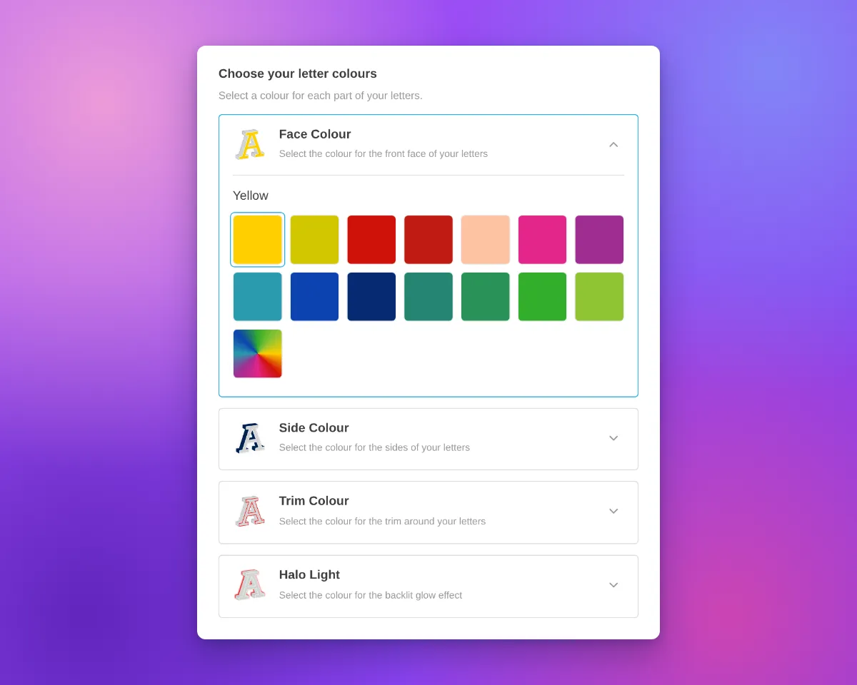
The cards are available on neon, letter and lightbox signs with more than one colour choice for their parts. In our demo customisers, acrylic channel letters have Face Colour, Side Colour, Trim Colour and Halo Light cards. Metal signs have Face / Front Lit and Back Lit cards. Lightboxes have Face, Border and Internal Light cards.

Most cards use the title and description you set for that colour part. If you do not set a title, the card uses a default part name. A shared Face and Border card shows the Face description.

Above the cards, the sidebar shows a heading with a title and a description. We added default text for neon, letter and lightbox signs. For example, neon signs show “Choose your colours”, letter signs show “Choose your letter colours” and lightboxes show “Choose your lightbox colours”. When the customiser shows step numbers, the heading has one step number for all the cards. If you set a title or a description before this update, we did not change it.

To change the heading, open the colour page of a sign part, for example Tube Colors or UV Colors. Then edit the Colour heading title and Colour heading description fields. All colour parts of a customiser use the same heading. On letter signs, you can also edit the heading on the Letter Types page. On lightboxes, you can also edit it on the Lightbox Types page. If you delete the text in both fields, the heading does not show.

Channel letter customiser sidebar with the heading "Choose your letter colours", Face Colour, Side Colour, Trim Colour and Halo Light cards, and the Face Colour card openLightbox customiser sidebar with the heading "Choose your lightbox colours", Face, Border and Internal Light cards, and the Face card open with colour swatches and an image upload area

On phones, the cards use the same layout. On phones and tablets, we also removed extra space above the first sidebar section. This space showed when a section above it was empty.

Neon customiser on a phone-width screen with the Tube Colour card open and the UV Print Colour card below it

What’s Changed

  • One card for each colour choiceEach colour choice for a sign part has a card with a name and an icon. On neon and letter signs, the icon shows the current colour. On a lightbox, the Face and Border parts can share one card.
  • One open card at a timeCustomers open a card to see its swatches. The other cards stay closed.
  • Colour headingA heading with a title and a description shows above the cards. Neon, letter and lightbox signs have default text. You can change or delete this text on the colour page of each sign part.
  • Your titles and descriptionsMost cards show the title and description that you set for each colour part.
  • New neon iconsThe tube colour and UV print parts have new neon icons that change to the selected colour.
  • Outline for light coloursNeon and letter sign icons in white and other very light colours have a thin grey outline.
  • Colour count badgeA card shows the number of colours when its part uses more than one colour.
  • Restore original colours swatchFor AI sign designer designs, the swatch shows colours from the original design. When a tube, UV print, face, trim or halo part uses its original colours, the swatch is selected and the name is “Original Colours”.
  • Single colour choiceA customiser with only one colour choice for its parts keeps the same colour section layout.
  • Phone and tablet spacingWe removed extra space above the first sidebar section when a section above it was empty.

Sep 27, 2026

2026.9

AI neon designs now show as lit tubes

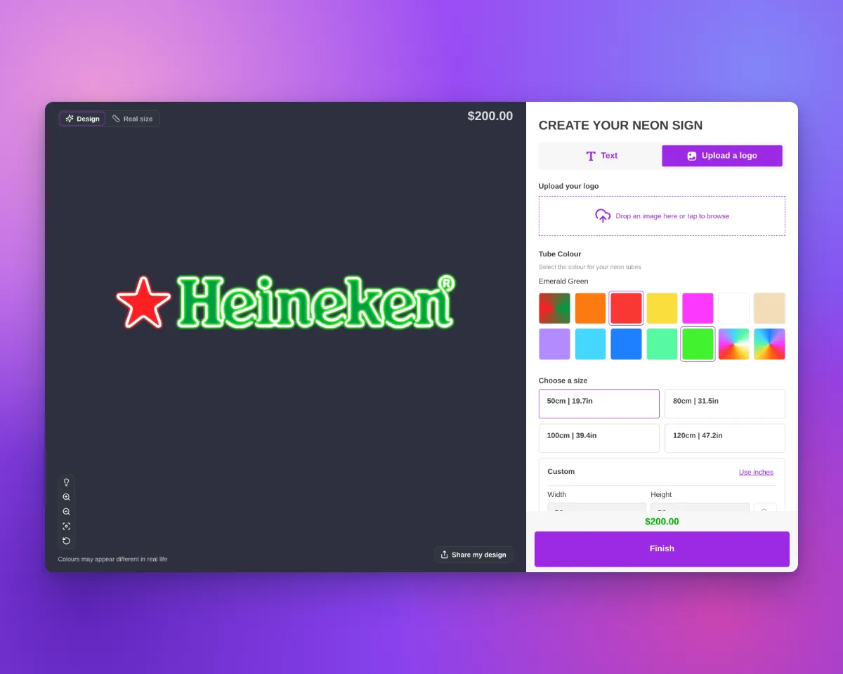
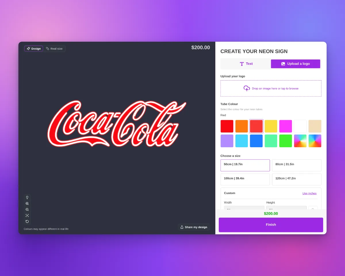
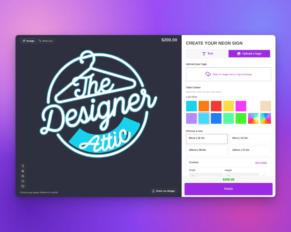
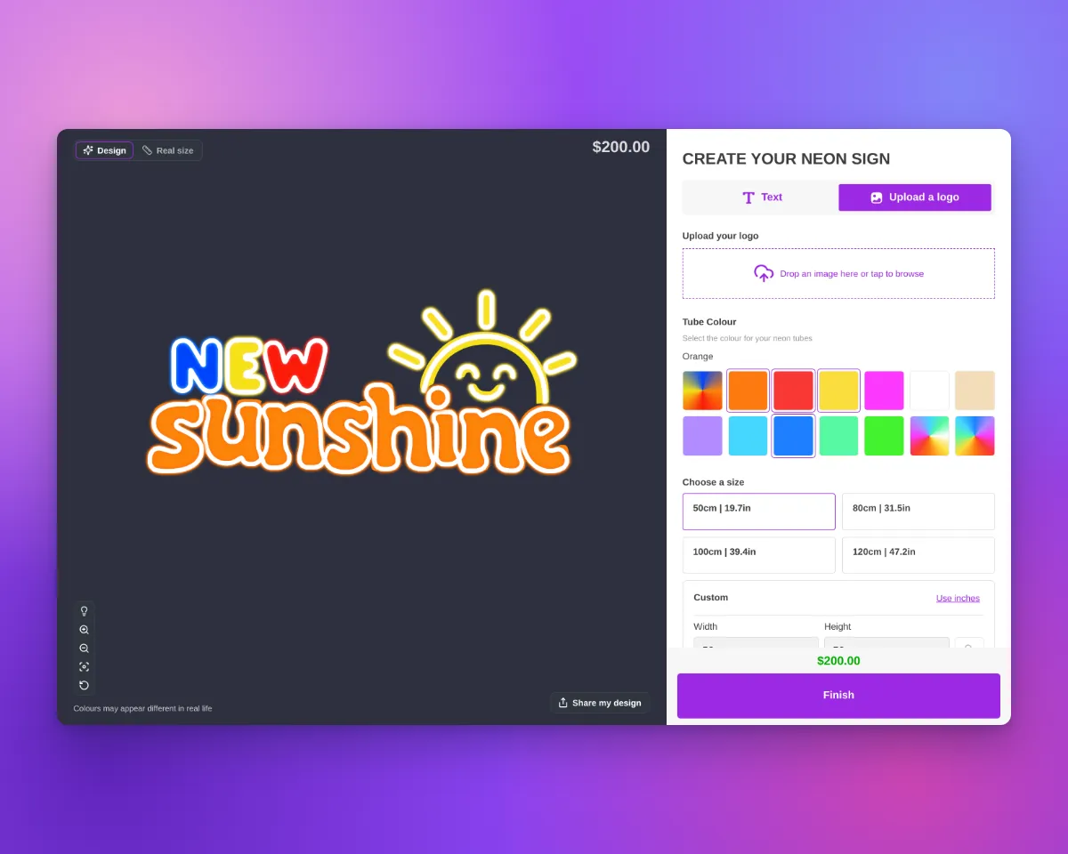
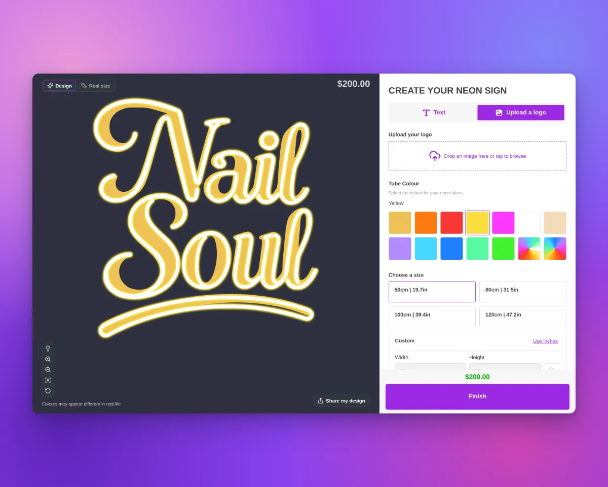
When AI Sign Designer V2 draws a neon design as neon line work, the customiser now shows the line work as lit neon tubes. The tubes have the same glow as neon text.

Update, 1 October 2026:From 1 October 2026, AI Sign Designer V2 does not add a UV print to new neon designs. The images on this page show designs from before this change. They have a UV print under the tubes. Those designs keep their UV print. When the UV print shows, the order includes the UV print file. Your manual UV print options do not change.

Customer customiser showing the Heineken logo as lit neon tubes with a green glow over green UV-printed letters and a red star, with no backboardCustomer customiser showing the Coca-Cola logo as lit neon tubes with a red glow over red UV-printed script, with no backboard

What’s Changed

  • Lit neon tubesThe tubes use the Glow Effect setting of your tube part, as neon text does. When the lights are off, the tubes show the jacket colour.
  • Tubes aligned to the artworkWhen it gives a better fit, Sign Customiser moves the tube drawing to align it with the flat artwork.
  • Uploaded logosShapes in uploaded neon logos no longer show an extra thin line on their edge. The trim outline does not change. Filled shapes now glow from their fill, as neon text does. When the tubes are white with a coloured glow, the glow is also smaller. Uploaded logos with Flow tube colours look the same as before.
Customer customiser showing The Designer Attic logo as lit neon tubes with a light blue glow over a light blue UV-printed band, with no backboardCustomer customiser showing the New Sunshine logo as lit neon tubes with blue, yellow, red and orange glows over matching UV-printed letters, with no backboardCustomer customiser showing the Nail Soul script logo as lit neon tubes with a yellow glow over gold UV-printed letters, with no backboard

Designs that have a UV print

Before 1 October 2026, AI Sign Designer V2 added a UV print to some new neon designs. For a UV print, the selected product type had an active UV part with at least one UV colour or a custom image. The flat colours of the design then showed as a UV print under the tubes. These designs keep their UV print:

  • Follows the product typeIf the customer selects a product type without UV print, the customiser hides the UV print. If they select a product type with UV print, the UV print shows again.
  • File with the orderWhen the design in the cart shows a UV print, Sign Customiser saves a UV print file with the product. The file has the UV colours of the final design and uses the same frame as the sign SVG.
  • Order emailThe default neon order email has a UV print artwork: line with a link to the file. If your customiser uses its own order email template, add the uvPrintLink variable to it.
  • Product pageIn the Design Files section of the product, the file shows as UV print artwork.
  • Hidden order propertyThe order line item has a hidden _UV print artwork property with the link to the file.
  • AI Design FilesA delivered design with a UV print has a Download UV print artwork button. This file has the colours from the AI, not the colours from the customer.
  • Sign SVGIf your customiser makes an SVG image of the sign, that file keeps the UV print and the tubes in separate groups. The tubes show in their tube colours.

Sep 26, 2026

2026.9

Refused AI designs now go to your fallback form

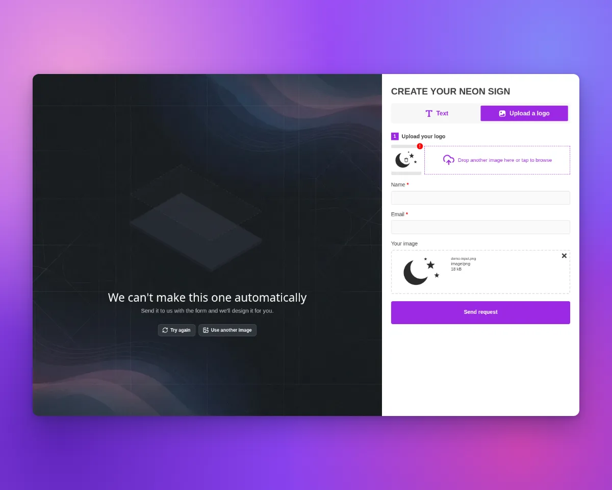
Sometimes the AI sign designer cannot turn an image into a sign that can be made. If you select a fallback form with a File Upload field, Sign Customiser now shows these customers that form, with their image attached.

What’s Changed

  • Fallback form on by defaultThe setting that sends refused designs to your fallback form is now on for all customisers, including customisers where it was off. To turn it off, open Custom Designs and clear Send designs that cannot be made automatically to the fallback form under Pricing & Configuration.
  • Clear message for refused designsWhen our checks refuse a v2 design, the setting is on, and your fallback form has a File Upload field, customers see “We can’t make this one automatically”. Your fallback form opens with this message. “Try again” and “Use another image” stay available.
  • Form request button after other failuresAfter other v2 failures, your fallback form does not open by itself. If your fallback form has a File Upload field, customers can select “Submit as a form request” to open the form with their image attached.
  • Editable textYou can change the refused design title, the refused design message, and the form request button text. Open Custom Designs and find these fields in the Language section.
  • No change without a formIf you do not select a fallback form, customers see the same failed screen as before.

Sep 25, 2026

2026.9

Clearer inch and pound figures across Sign Customiser

This update adds inch and pound values beside metric values in existing settings. The merchant admin still converts new size entries to centimetres when you save them. Enter 31 inches. The field shows 31 inches after you save and reload. Rates entered per pound keep the same figures.

What’s Changed

  • Whole inches stay whole. Existing size settings have an inch value beside the centimetre value. A saved whole-inch entry such as 31 inches displays as 31 inches.
  • Pound rates keep their figures. Pound-authored rates in this update display the same figures as before. One pound equals exactly 0.45359237 kilograms in calculations.
  • Divisors show full units. For volumetric shipping, the merchant admin shows the divisor you set with its unit. When the customer price breakdown is visible, it shows that divisor and the metric divisor used for calculations. Suggested starting values are 5000 cm³/kg, 139 in³/lb, and 2268 cm³/lb. The 305 in³/kg starting value comes from a calculation. It is not a carrier value. Use the divisor that your shipping carrier gives you.
  • Fixed Sign Depth can vary. For non-Lightbox volumetric pricing, enter a depth greater than zero at each size boundary. Later boundaries can use the same depth or a smaller depth.
  • Rates show their stored precision. The customer price breakdown displays per-unit rates without rounding them to two decimal places. Charges and totals still round to currency decimals.
  • New demos use round inches. New demo customisers for inch Stores use round inch sizes. The merchant admin rounds calculated parcel costs. It does not show long decimal tails.

Read the earlier inch and pound update and how to enter measurements in inches and pounds for more detail.

Sep 25, 2026

2026.9

New controls on the sign preview

The sign preview has new controls. The preview buttons now use the same dark tile, and each group of buttons stays in its own corner. Backgrounds now show in one tray. This change applies to the preview on every Store. You do not need to change any settings.

What’s Changed

  • One control styleThe tool buttons, Share my design and Upload Background use the same dark tile with white icons. The tile does not change with your colour scheme.
  • Your accent colourYour Store’s secondary colour shows the active button, the selected background and the hint icon.
  • Fixed cornersOn desktop, the tools stay at the bottom left. Share my design, Upload Background and the backgrounds stay at the bottom right. When a button is not available, the other buttons do not move.
  • A plain-text hintThe prompt to select a word is now text with an icon. It does not look like a button.
  • One background trayBackgrounds show as small tiles in one strip. The customer’s own photo comes first, with a remove button. The other backgrounds show at full strength, and customers can compare them.
  • Phone layoutOn a phone, the Background button in the tool rail opens the tray next to it. The tray shows only when the customer asks for it. It replaces the old panel at the top of the preview. The tray stays open after a customer selects a background, and it closes when the customer taps outside it.
  • No empty trayWith one background and no upload, the preview shows no tray. With one background and upload allowed, desktop shows only Upload Background until the customer adds a photo.
  • Control bar layoutIf your customiser uses the bottom control bar, its buttons use the same tiles. Its background popover keeps your Theme Colors “Control Bars” colours.
  • Lightbox signsOn desktop, the lightbox 3D control bar does not change. Its background popover shows the new background tiles.
  • Custom CSSThe preview controls have a new structure. If you use custom CSS on the preview controls, check it after this change.

Sep 25, 2026

2026.9

Find Sign Makers Pro is now included with your Sign Customiser subscription

You can now link a Find Sign Makers listing to your Store. Find Sign Makers Pro is then included with your Sign Customiser subscription. Linking started on 17 September 2026. Our 16 September entry gives both ways to get Pro.

  • Linking is liveFind Sign Makers Pro is included with an active paid Sign Customiser subscription when your listing is linked and publicly verified. Not on trial or the Development plan. It ends when the subscription ends or the listing is unlinked.
  • Link from your adminOpen the Find Sign Makers Pro page of your Sign Customiser admin. Select “Link a listing”. Search for the business name. Only the Store owner or a company owner can link a listing.
  • The manufacturer agrees by emailWe send a one-time link to the email address on the listing. The manufacturer accepts it while signed in to Find Sign Makers. The link expires after 7 days.
  • A followed website linkThe website link on a Pro profile is a followed (dofollow) link. We do not promise a change to your search rank.
  • You can still buy Pro on its ownA manufacturer without a linked Store can buy Pro for USD 100 per year. No tax is added.
  • Manufacturing Partners is a different programmeA Sign Customiser subscription includes Find Sign Makers Pro. It does not include Manufacturing Partners.

Sep 25, 2026

2026.9

AI Sign Designer V2 shows customers each step as it makes their design

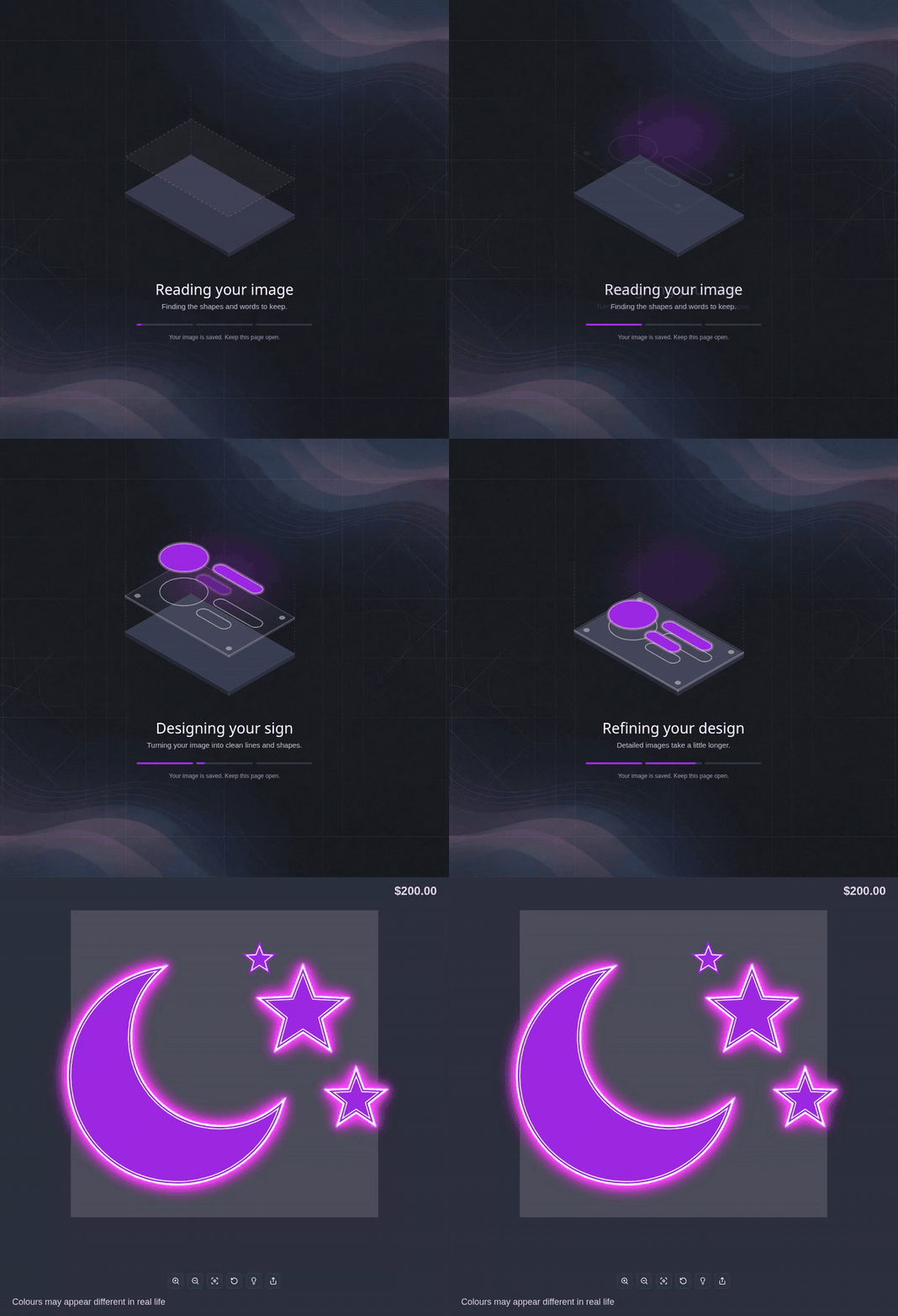
When a customer uploads an image to AI Sign Designer V2, they see an animated drawing of a sign while the design is made. The layers of the sign move into position step by step. A short message shows what occurs at each step. If the design fails, the customer can try again or upload a different image. You can also let the customer send the image to your team with your fallback form.

AI Sign Designer V2 loader: the sign drawing moves from Reading your image to Designing your sign, where three parts appear one after another, then to Refining your design and Putting it all together, and then the finished neon design opens

What customers see

  • Reading your imageA base panel and a dashed outline of the design move slowly up and down.
  • Designing your signThe three parts of the design appear one after another, in approximately four seconds.
  • Refining your designIf the design takes more than one minute, the message shows that detailed images take more time.
  • Putting it all togetherThe layers move together and become bright. Then the customiser shows the finished design.

On desktop, the message Your image is saved. Keep this page open. shows below the progress bar while the design is made.

To change the Reading your image message and the messages that show when a design fails, open Custom Designs. In the Language section, use Upload pending title, Upload pending description, Upload failed title, Upload failed description, Failed upload text on desktop, Failed upload text on mobile, Refused design title, Refused design message, Form request button and Try another image button. You cannot change the messages for the other steps.

When a design fails

Refused design screen with the message We can't make this one automatically, and the fallback form open with the customer's original image attached
  • A design that cannot be madeSometimes our checks refuse a design. Then the customer sees We can’t make this one automatically, and your Fallback Form opens with the customer’s original image attached. The customer can also select Try again or Use another image.
  • Other failuresAfter a different failure, such as an error or a time-out, the customer can select Try again to use the same image again. They can select Use another image to upload a different image. They can also select Submit as a form request to open your fallback form with the image attached.
  • Your fallback formThese form options need a Fallback Form that has a File Upload field. Select it in Custom Designs. The setting Send designs that cannot be made automatically to the fallback form is on by default for all customisers. For more information, see Refused AI designs now go to your fallback form.
  • No credit usedA failed design does not use an AI credit. AI Sign Designer V2 uses one AI credit only when it delivers a design.

Get started

Add Sign Customiserto your store today

Install now
36+ verified reviews

Login

Universal Sign In
  • WordPress
  • Wix
  • Etsy
  • Squarespace
  • Webflow

Or, if on Shopify, navigate to your store admin to login.