

Target customiser parts with stable CSS class names
Use stable npc- and sc- CSS class names to style customiser controls, pop-ups and the page wrapper, and learn where each CSS rule must go.
Last updated:
Most visible parts of the customer customiser have a CSS class name. Sign Customiser does not rename these names. Use them in your custom CSS to style buttons, forms, pop-ups and the wrapper around the customiser. Sign Customiser keeps these class names after an update. This article is for merchants who write CSS.
Before you start
-
You must know basic CSS.
-
Read Custom CSS. It shows how to add CSS and gives example code.
Stable prefixes
Two prefixes are stable.
-
npc-names are for the customer customiser. They cover the options panel, the preview area, forms, prices, loading screens, pop-ups and the Customiser Links page. Examples:npc-sidebar,npc-frame-preview,npc-selections-font-list. -
sc-names are for the wrapper in your web page. They cover the container, the customiser frame, the pop-up (modal) shell and the loading placeholder. Examples:sc-embed-container,sc-customiser-frame,sc-customiser-modal-overlay.
Other class names are not stable. Tailwind classes that start with tw-, IDs other than #neon-customiser-app, and data-testid values can change in an update. Do not use them in your CSS.
Where to put your CSS
The display mode of the customiser decides which CSS can affect it.
Display mode | Where to put |
Shopify Sign Customiser block (default) | Edit CSS or your theme CSS. The customiser is part of your page. Both can affect it. |
Shopify block with Use iframe (experimental) on, the | Edit CSS only. The customiser is in an iframe. Theme CSS cannot affect the content of an iframe. |
Customiser Links page (hosted) | Edit CSS only. |
Put sc- CSS in your theme CSS. The sc- wrapper is part of your page.
To save CSS in Edit CSS, do these steps:
-
Open the customiser in the merchant admin. Custom CSS shows the full path.
-
Click Edit CSS above the preview. If the preview is not on the page, click Preview in the page header first.
-
Type your CSS in the Custom CSS box. The preview updates when you stop typing.
-
Click Save.
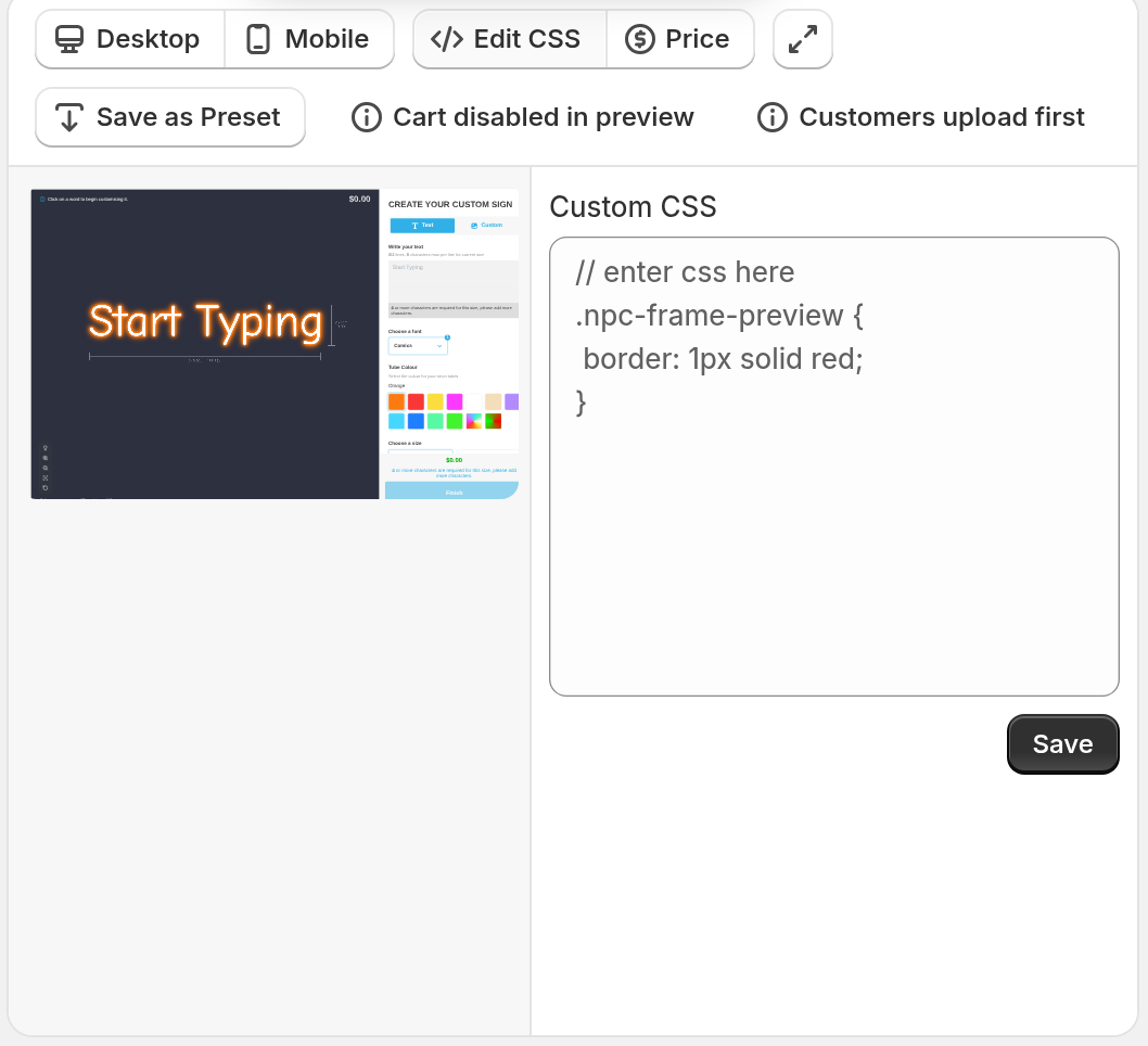
Saved CSS applies in all display modes: inline, iframe, hosted and pop-up.
Style a part of the customiser
Write one rule for each part. Start the rule with the stable class name.
#neon-customiser-app .npc-selections-font-list .npc-list { grid-template-columns: repeat(4, minmax(0, 1fr));}The #neon-customiser-app container holds the options panel, the preview area and the other main parts.
Pop-ups, tooltips and loading screens
These parts are not inside #neon-customiser-app. The customiser adds them at the end of the page body. Each part has the class npc-portal and a class of its own. Write the rule without #neon-customiser-app:
.npc-portal.npc-image-modal { background: rgba(0, 0, 0, 0.8);}A rule that starts with #neon-customiser-app does not match these parts.
Part | Class |
Message pop-up |
|
Plain pop-up |
|
Image pop-up |
|
Loading screen |
|
Add-to-cart progress window |
|
Tooltip |
|
Image preview on hover |
|
Image crop pop-up |
|
States
A part can have a state class. A state class is the base class, two hyphens and a state word. These state words are examples:
-
--active, for examplenpc-visualiser-control--active -
--open, for examplenpc-selections-letter-part-card--open -
--disabled, for examplenpc-share-button--disabled -
--error, for examplenpc-add-to-cart-loader--error
The add-to-cart progress window has one state class for each stage: --generating, --uploading, --creating-product, --adding-to-cart, --success and --error. Add the state word to npc-add-to-cart-loader.
Some selected options have the older class npc-selected. Only parts that had this class before have it.
A part has a state class only while it is in that state. Use Inspect to see the classes that a part has now.
The wrapper in your page
Part | Class |
Container around the customiser |
|
The customiser element |
|
The iframe |
|
Button of the Sign Customiser Modal block |
|
Pop-up background |
|
Pop-up box |
|
Pop-up close button |
|
Message for missing embed settings |
|
The pop-up shell has inline styles for its size and colours. Add !important to your rule to change them. Put the rule in your theme CSS.
To add your own class to the Sign Customiser Modal block button, use the Additional Button Classes setting in the theme editor. Modal display shows the setup.
Find a class name
-
Open your customiser page.
-
Right-click the part you want to style. Click Inspect.
-
The Elements panel selects the part in the DOM tree. Read its
classattribute. Find the names that start withnpc-orsc-. -
For a pop-up, open the pop-up first. Then look near the end of the
bodyelement.
Limits
-
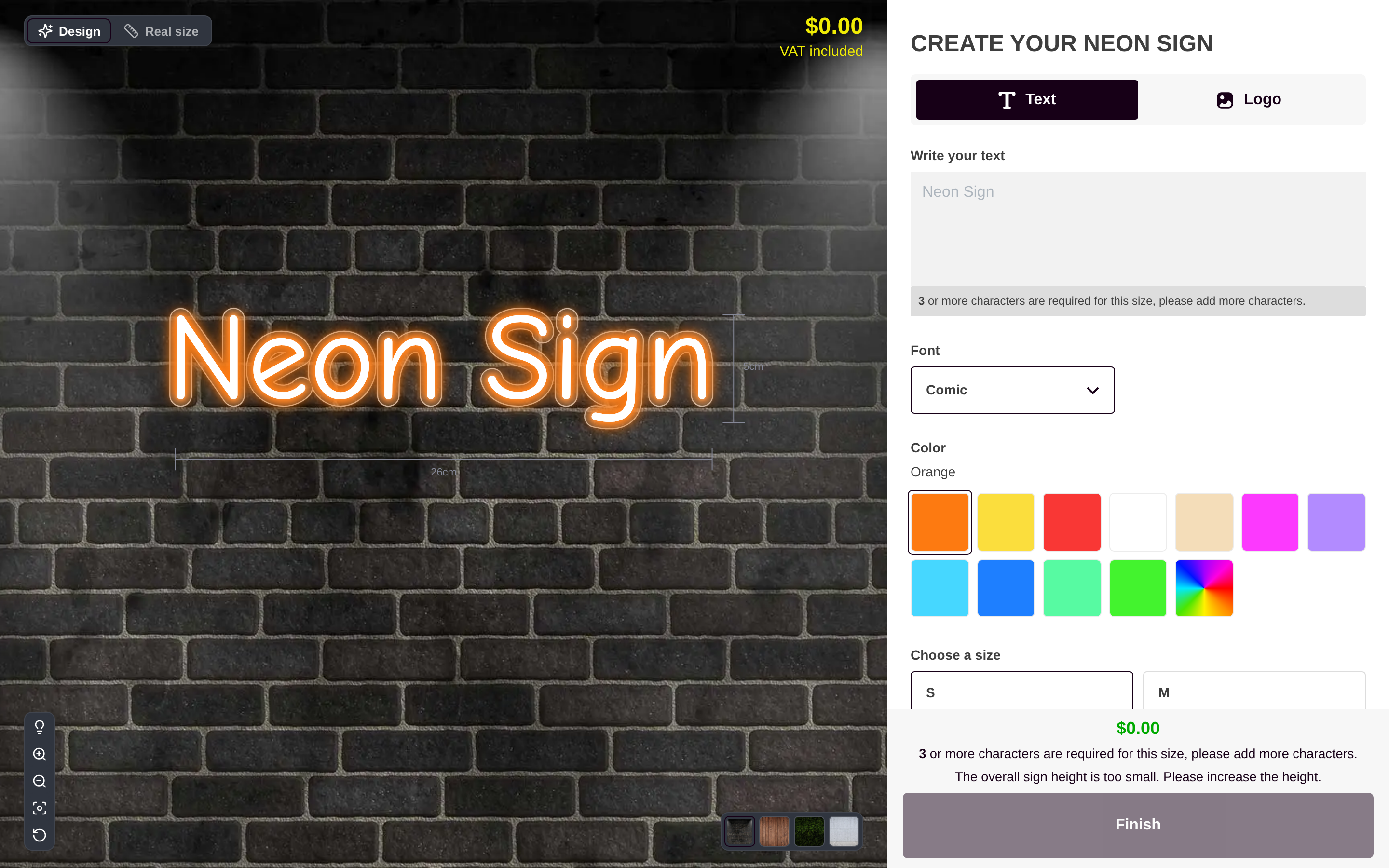
The sign is drawn on a canvas. CSS cannot change the text or the shapes of the sign. You can style the frame around the sign, for example
npc-frame-preview. -
Only
npc-andsc-class names are stable. Do not usetw-classes. -
Sign Customiser does not rename a stable class. It removes a class only when no customiser part uses it and no store’s custom CSS targets it. An update can add new classes.